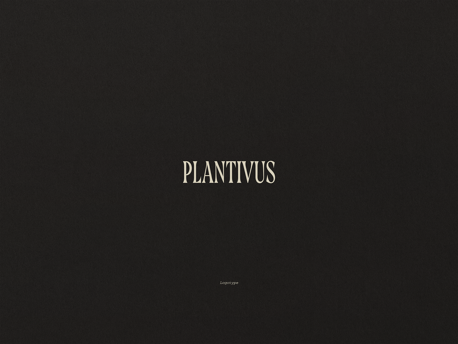
Three logo proposals as part of the brand identity for PLANTIVUS, a company specialized in essential oils and natural cosmetics. The aim is to provide the first visual guideline with graphic elements that denote an elegant and modern, yet enduring character.
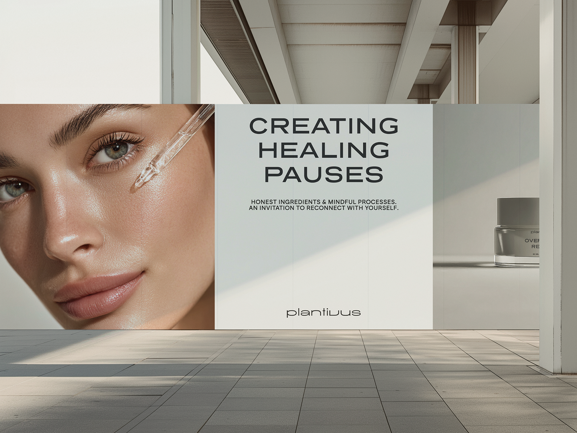
These proposals also aim to communicate its products profile, based on its natural and sustainable processes, its exceptional quality of service resulting from the close relationship with each client, and with the vision of positioning itself as a leading brand in the sector throughout Europe.
The history of Plantivus dates back to 2019, when Cosmetics Tenerife was born as a local project dedicated to wellness and conscious beauty. However, the pandemic redirected global habits and paved the way for a renewed interest in natural, essential, and homemade products. This change drove the brand's transition toward the development of pure oils, botanical ingredients, and artisanal cosmetic solutions. Thus began an evolution guided by calm, introspection, and authentic care.
This growth revealed structural limitations marked by the economic and logistical particularities of the Canary Islands. Although Cosmetics Tenerife established itself as a benchmark in aromatherapy and personalized service, its strongly local identity made it difficult to expand to mainland Spain and the rest of Europe. Expensive shipping and long delivery times reinforced this perception. The founder then realized that he needed a brand capable of transcending borders without losing its essence.
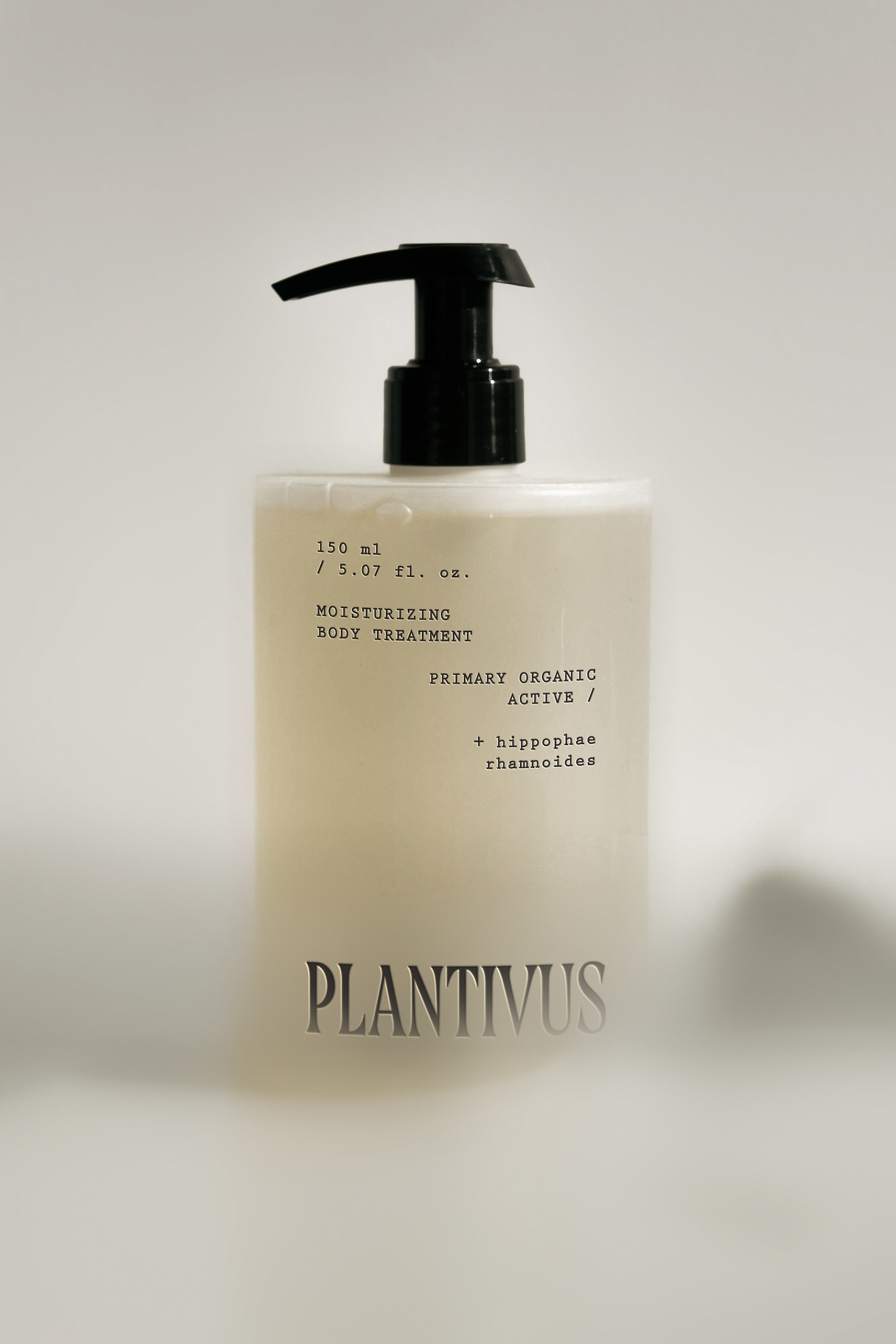
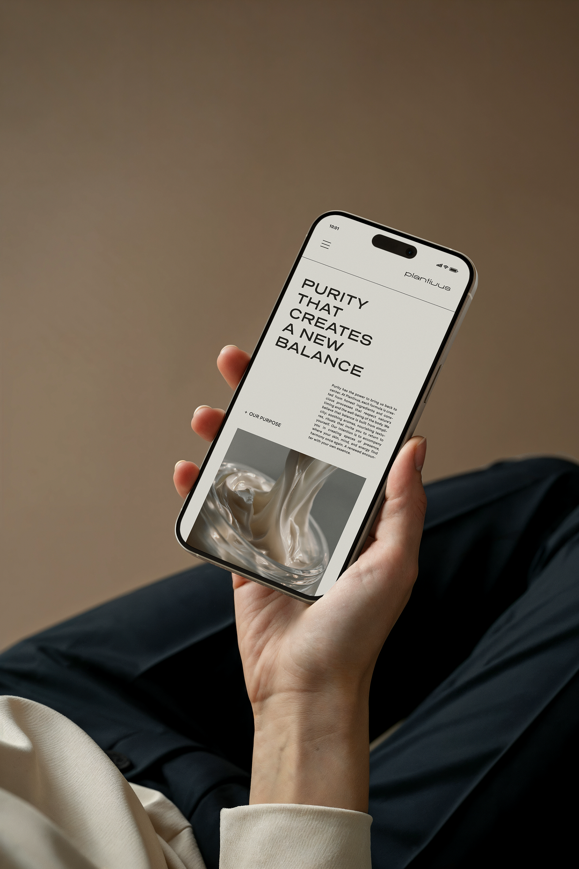
Plantivus emerges as a strategic and natural response to this vision of conscious expansion. It represents botanical purity, the honesty of its processes, and the humane treatment that has always defined it, now in a more global and sophisticated narrative.
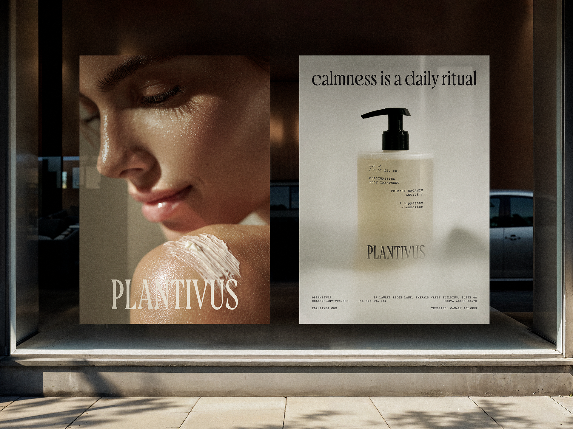
The three logo proposals for this project express the essence of Plantivus: elegant simplicity, natural harmony, and a deeply human sensibility that allows the message to breathe. Each proposal is a variation in perspective on the same brand universe, where serenity guides the design and nature inspires every stroke to sustain a lasting and much more conscious vision.

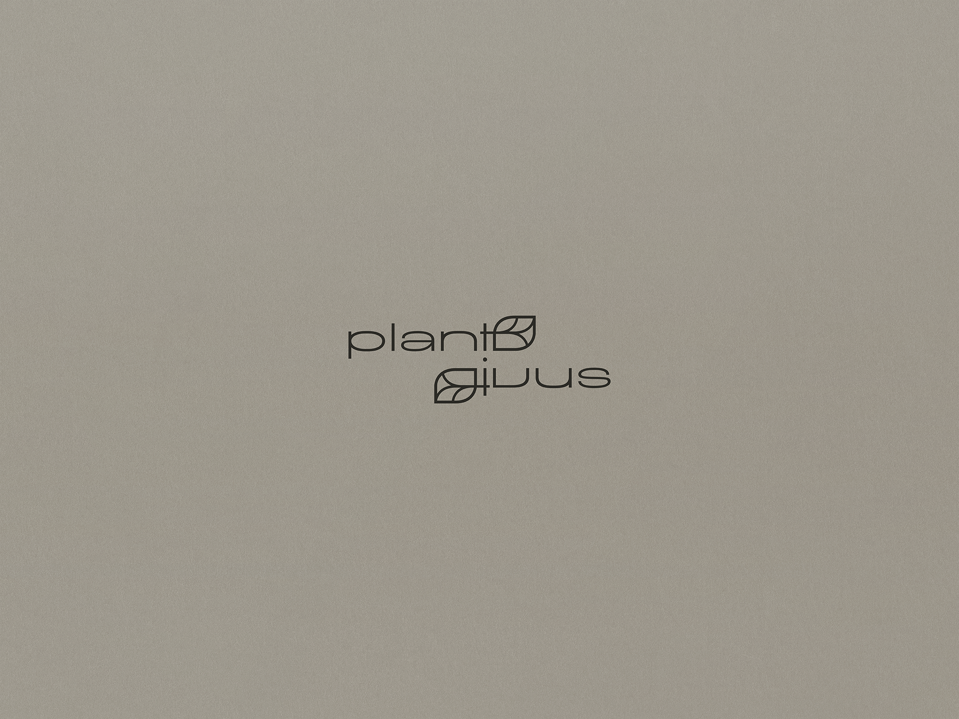
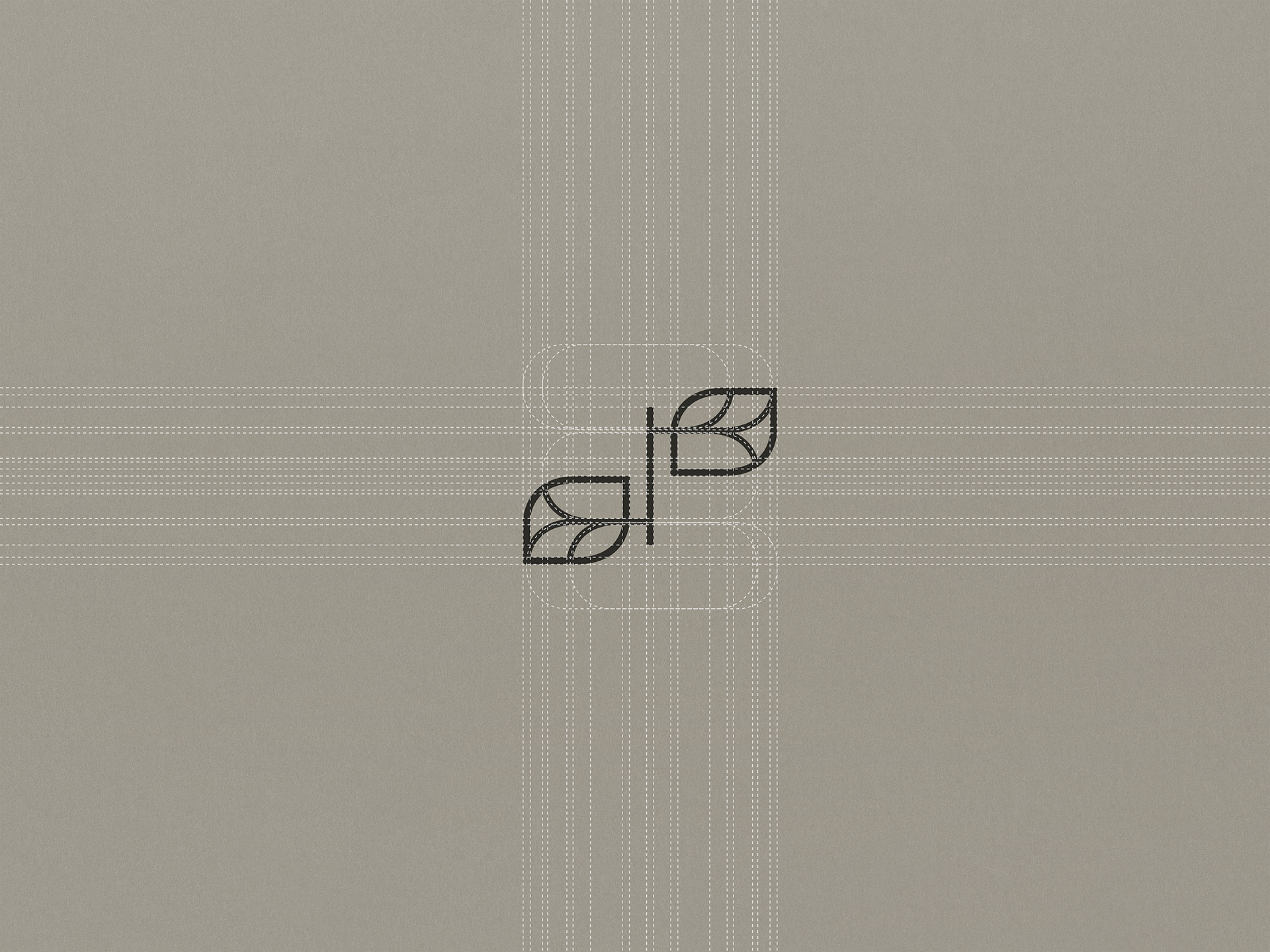
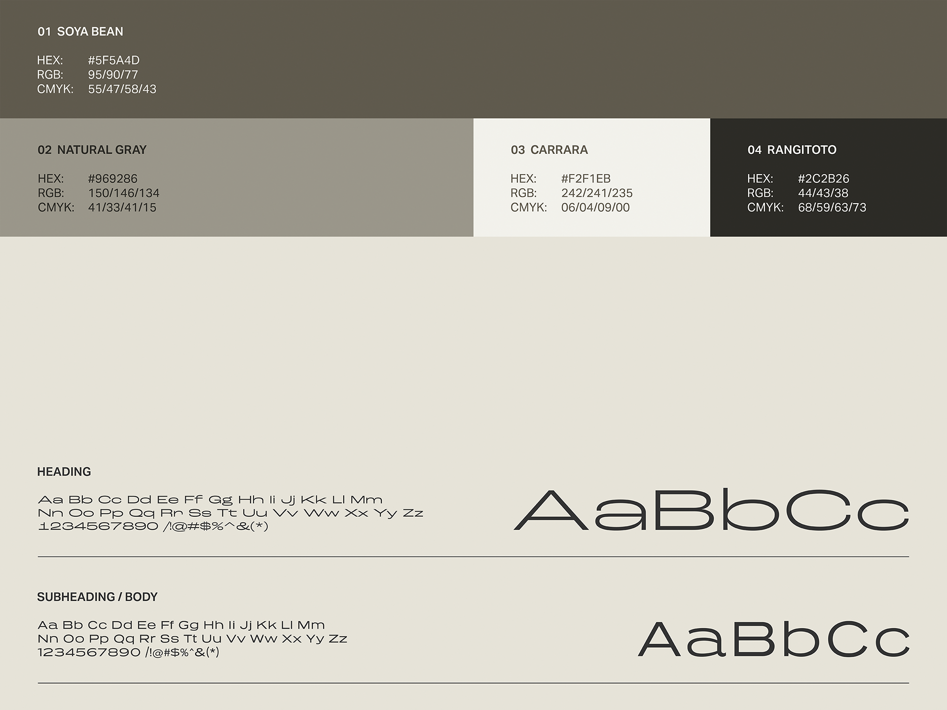
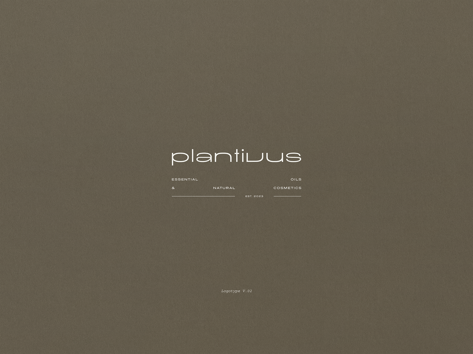
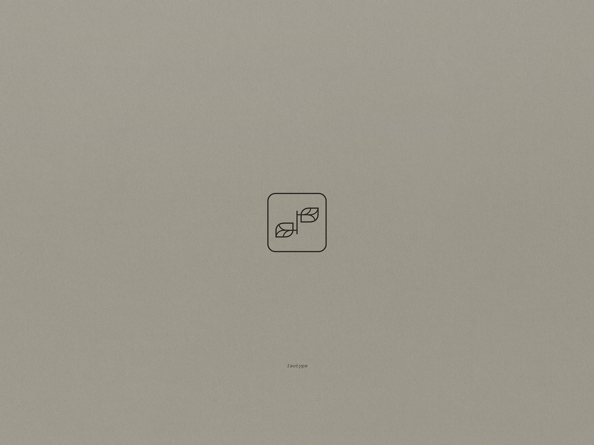
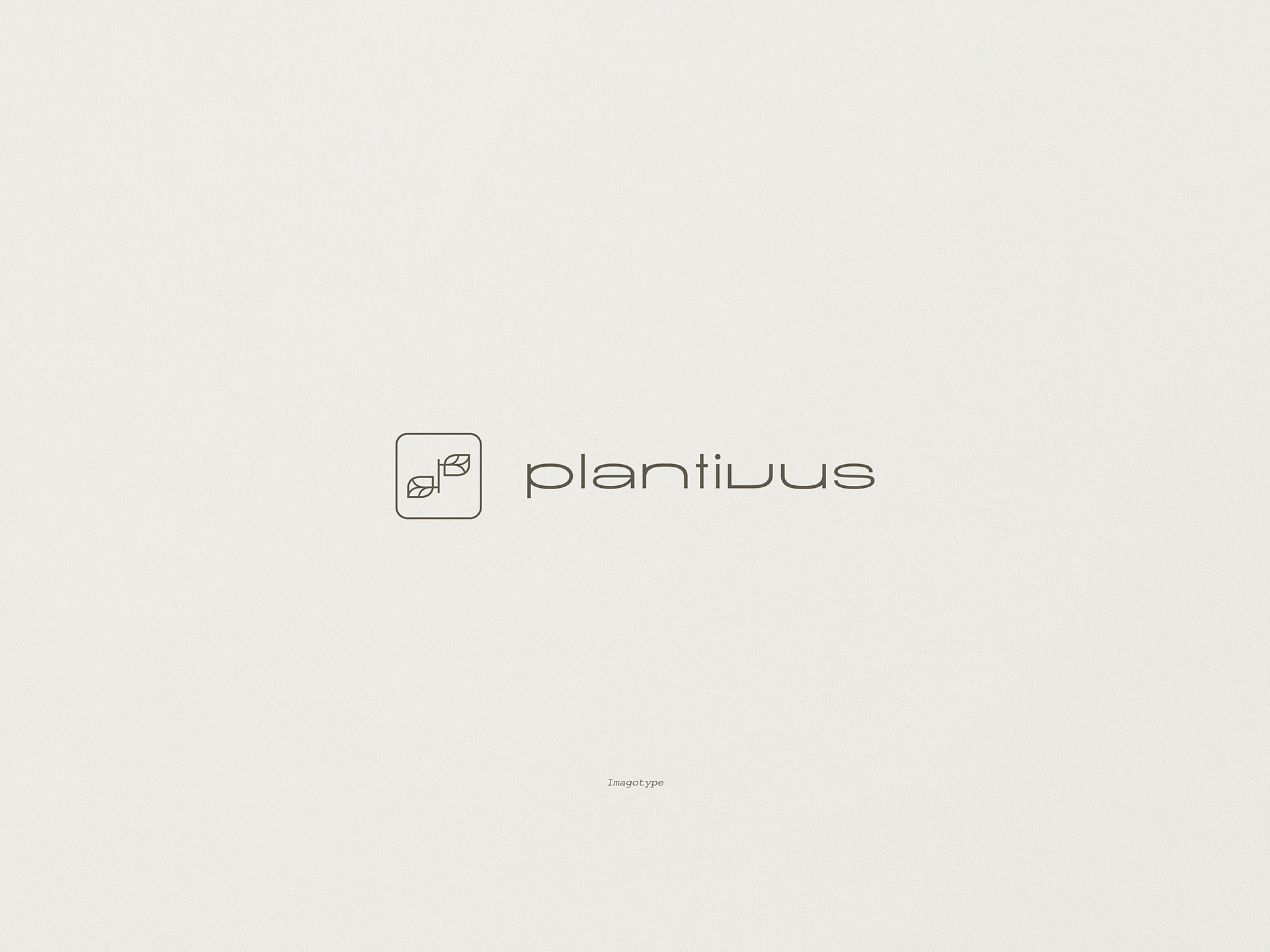
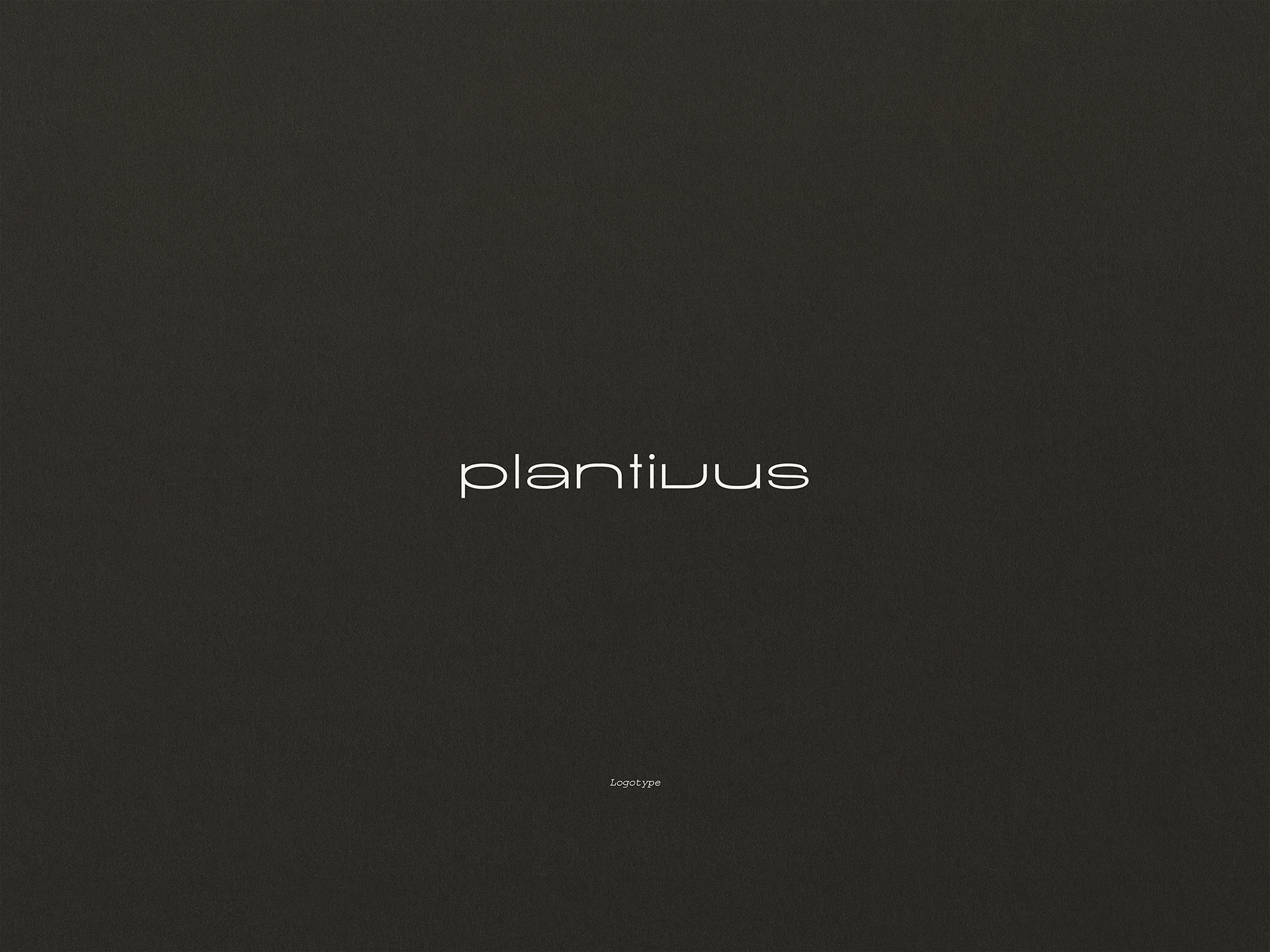
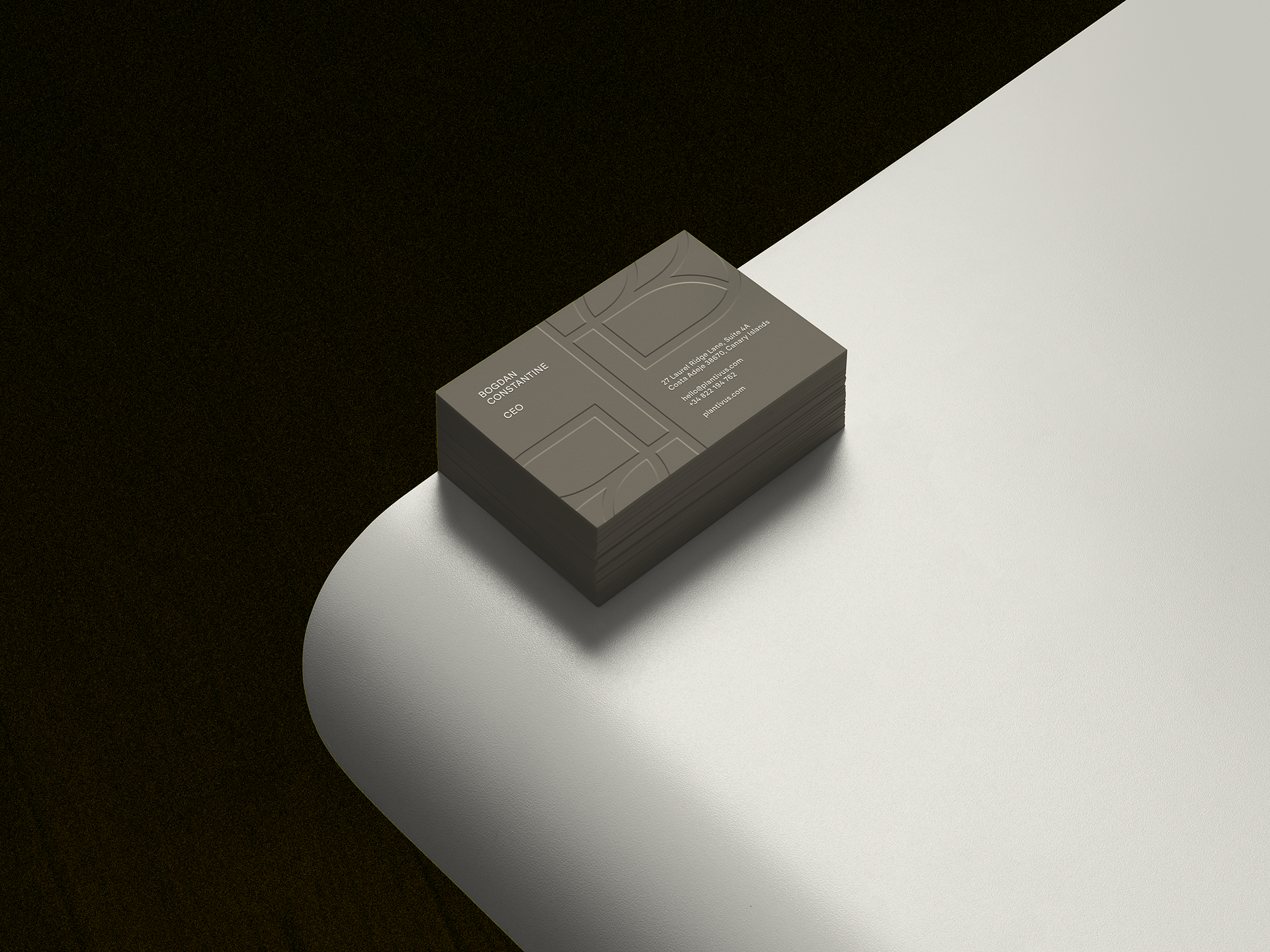
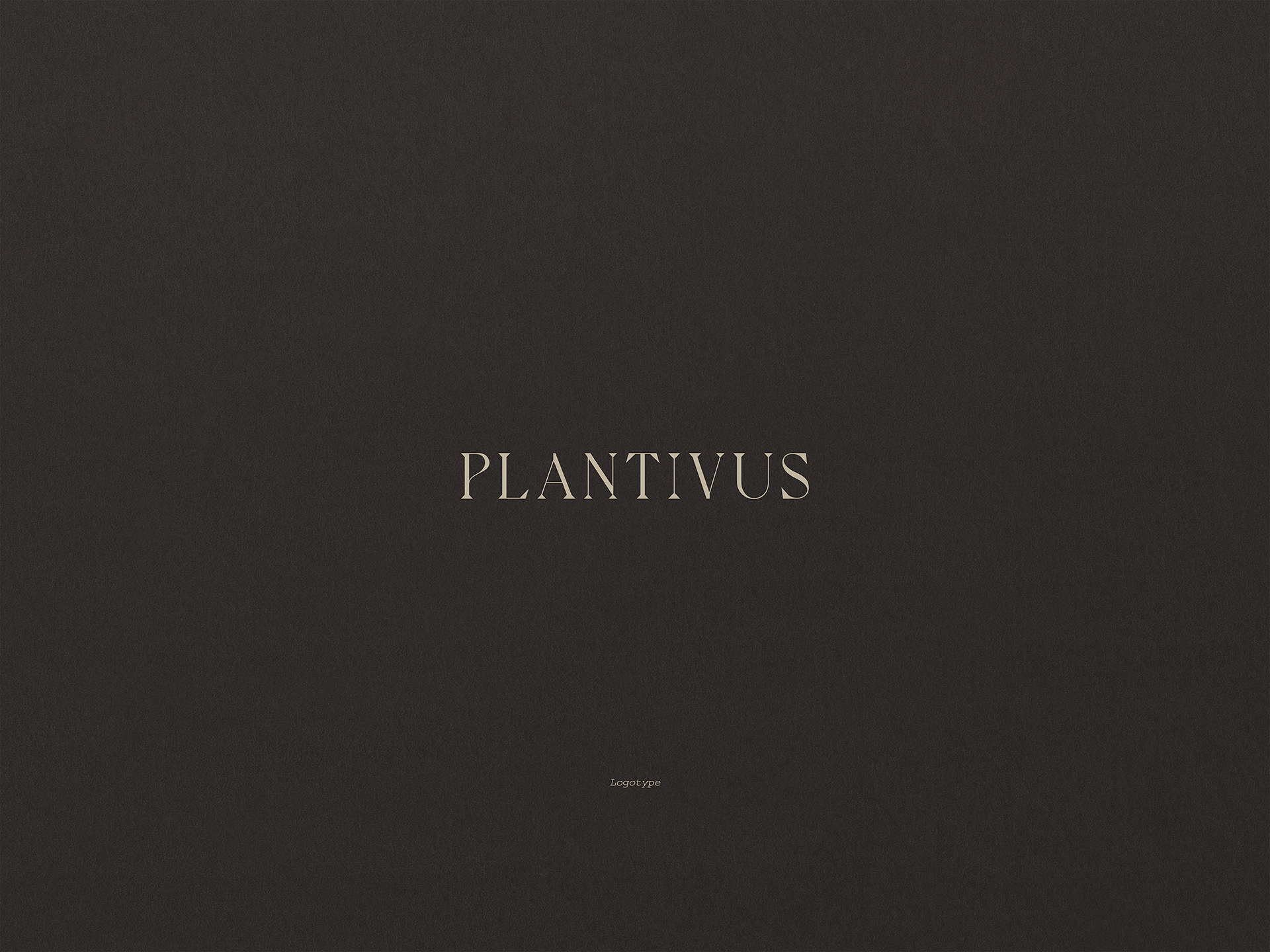
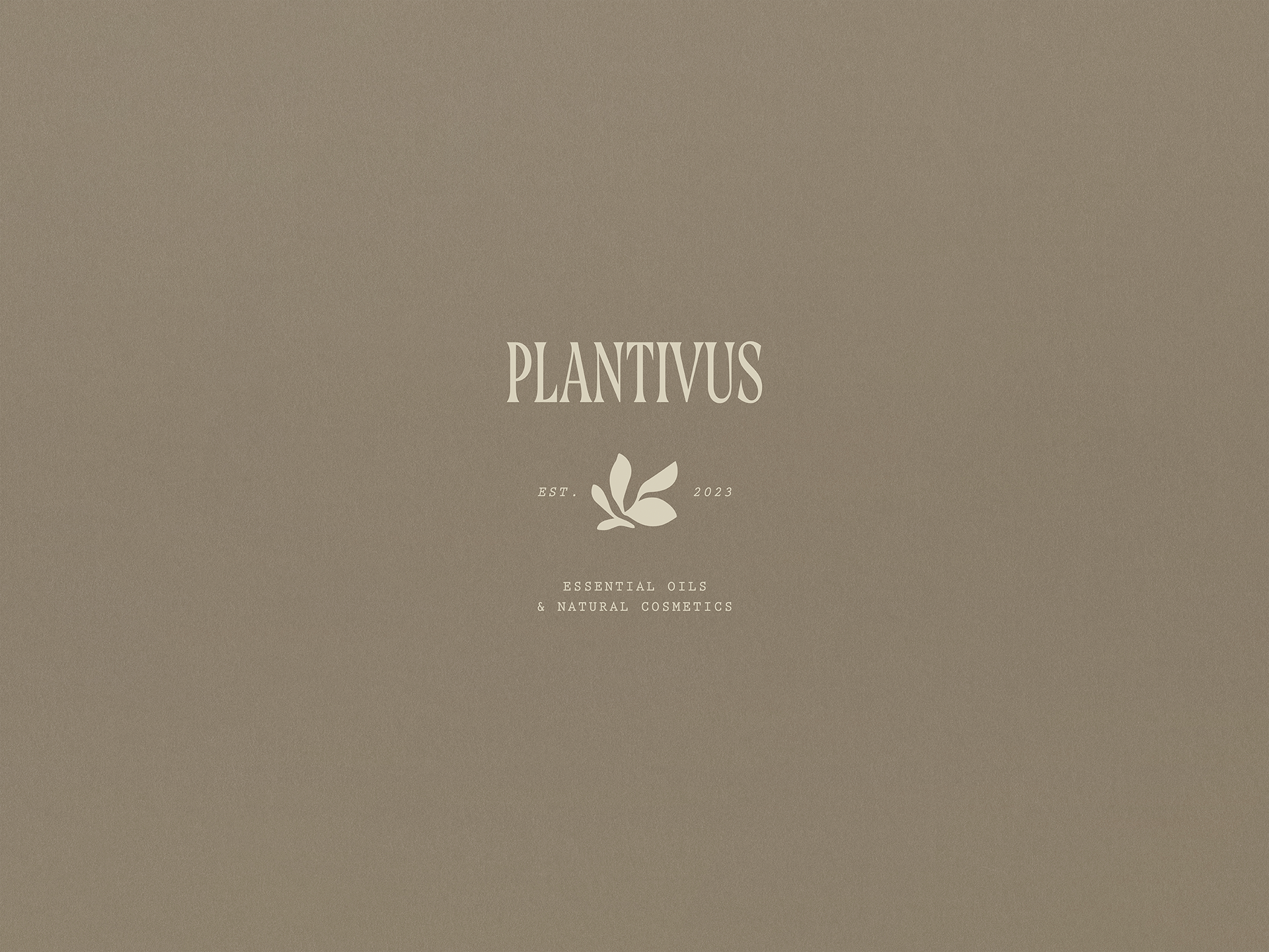
The first proposal is based on the concept of science, modernity, and calm, reflected in the use of a broad, clean, and balanced typeface that breathes at a slow pace. The rounded shapes extended in its typography amplify the feeling of interior space, aligning with the brand's vocation to accompany natural internal and external processes. For its part, the graphic construction has been measured in such a way that the letters “n”, “t”, “i”, and “v” seem to generate a continuous cycle, inspired by the suffix “ivus,” which means “the ability or willingness to do.” This composition suggests an infinite cycle, a leisurely continuity that reinforces the vision of using Plantivus products in a daily, conscious ritual.
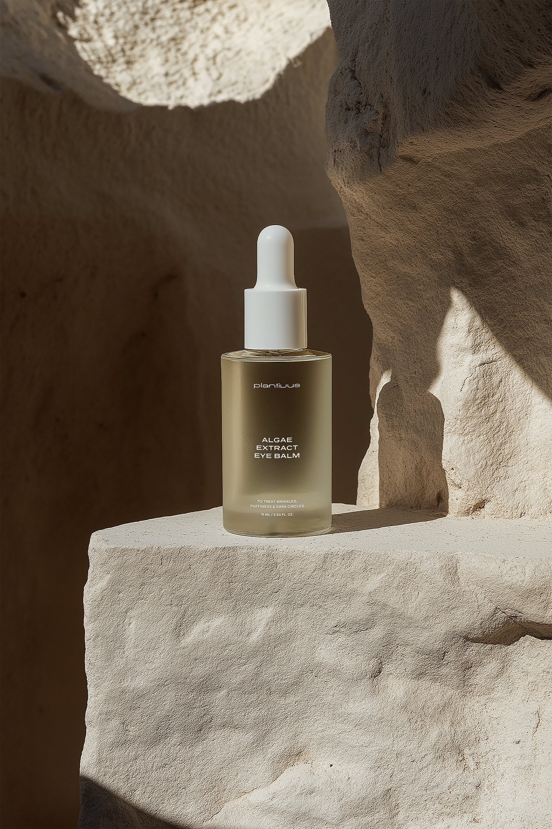
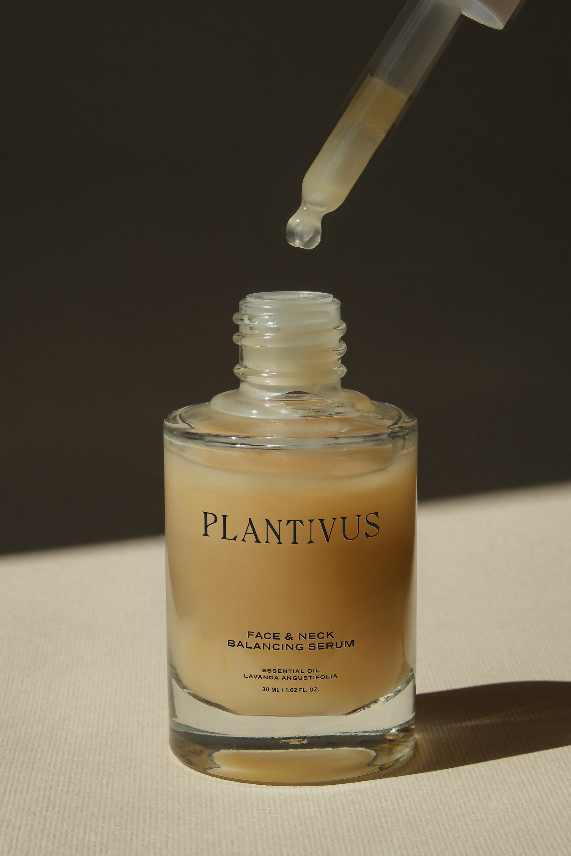
The color palette—Soya Bean, Natural Gray, Carrara, and Rangitoto—deepens this narrative by evoking mineral landscapes, calm leaves, pure clays, and the solidity of damp earth. These are tones that speak of restraint, sobriety, and a quiet beauty, characteristic of a brand that embraces nature from a contemporary perspective. Each color acts as an emotional anchor, inviting us to slow down and enter a state of conscious stillness. The interplay between warm and cool tones reflects the duality of Plantivus: scientific and botanical, modern and ancestral, precise and sensory. Together with the typography, the cyclical composition, the growing plant isotype, and the color palette, this proposal creates a visual experience that feels honest, organic, and deeply human.
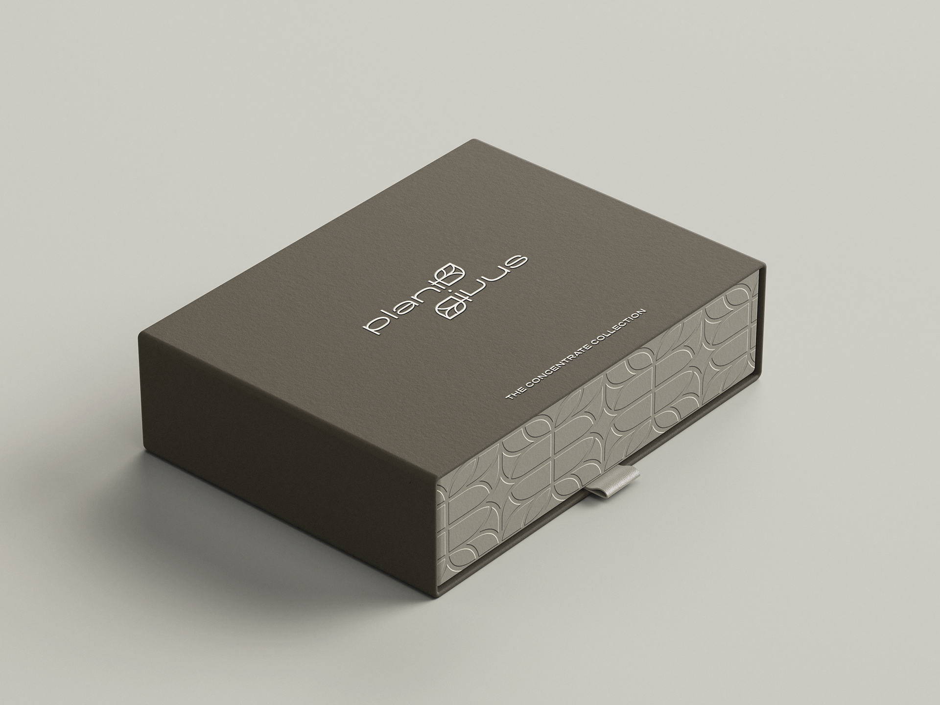
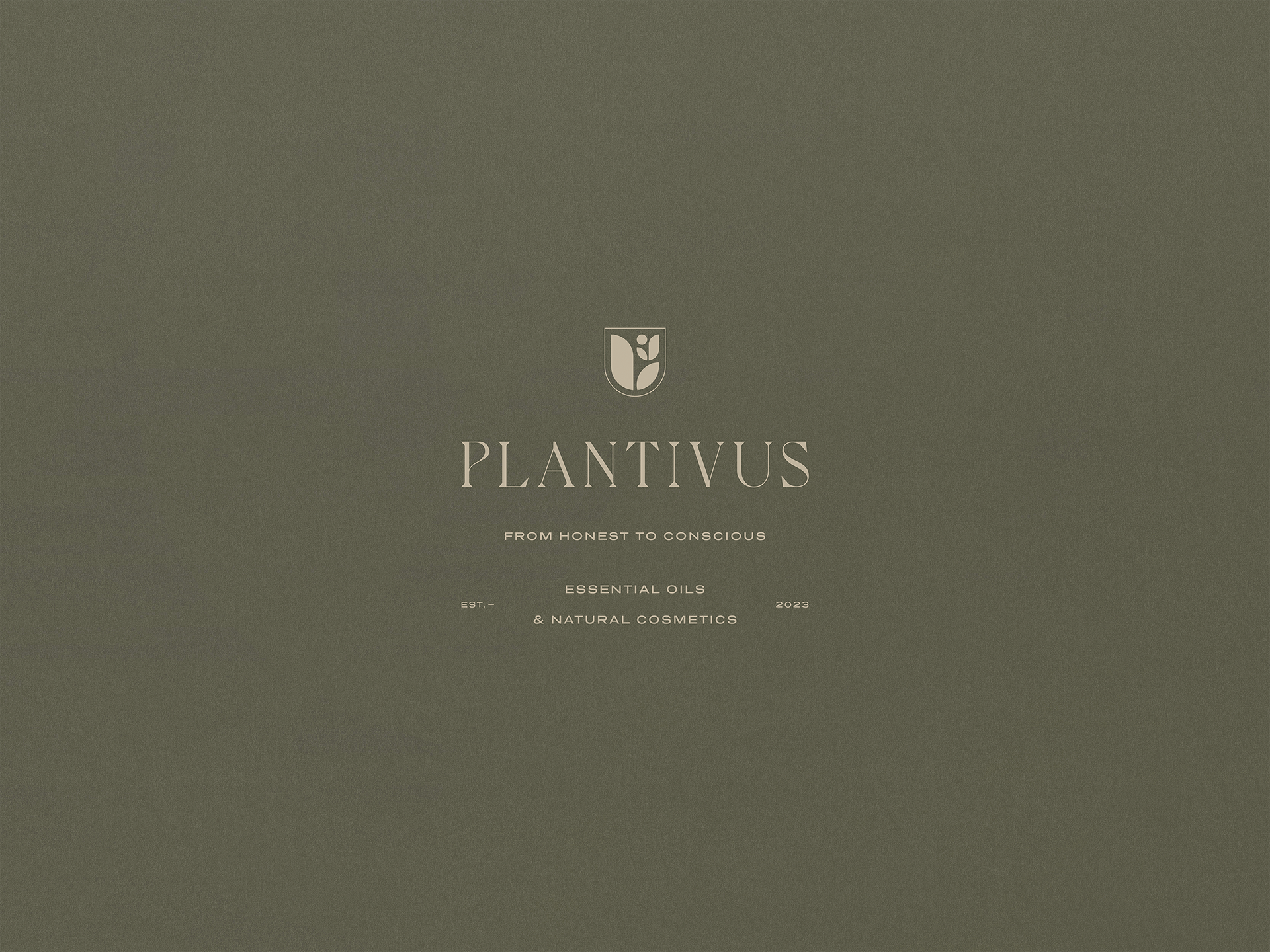
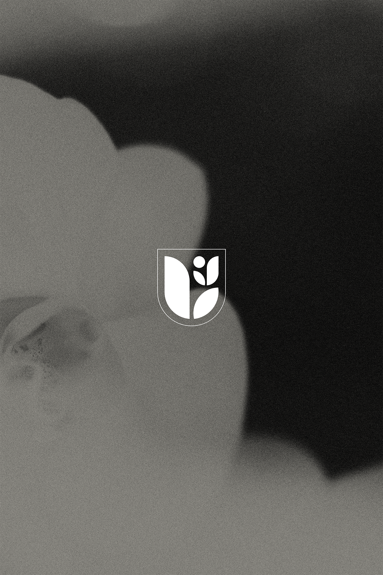
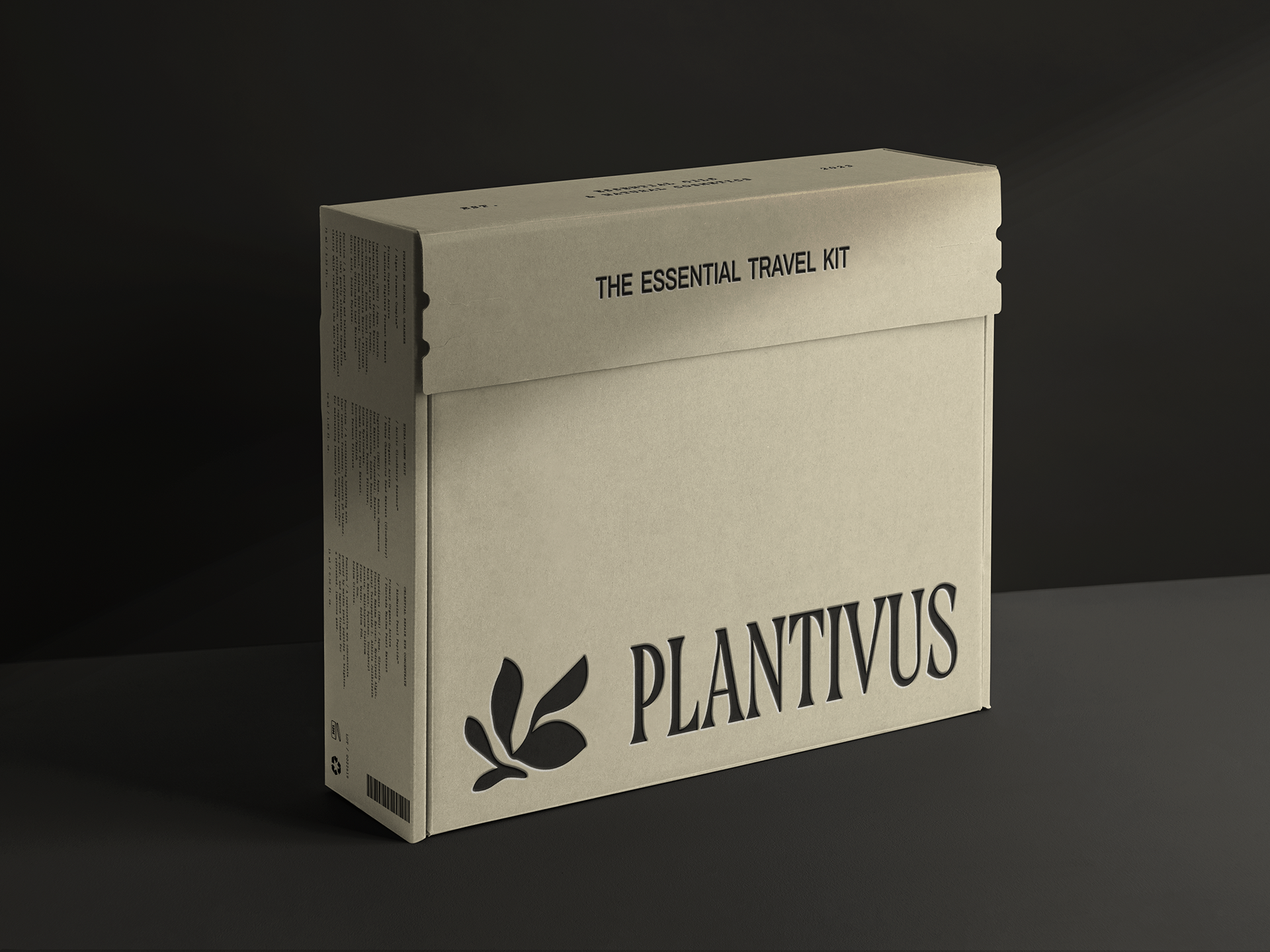
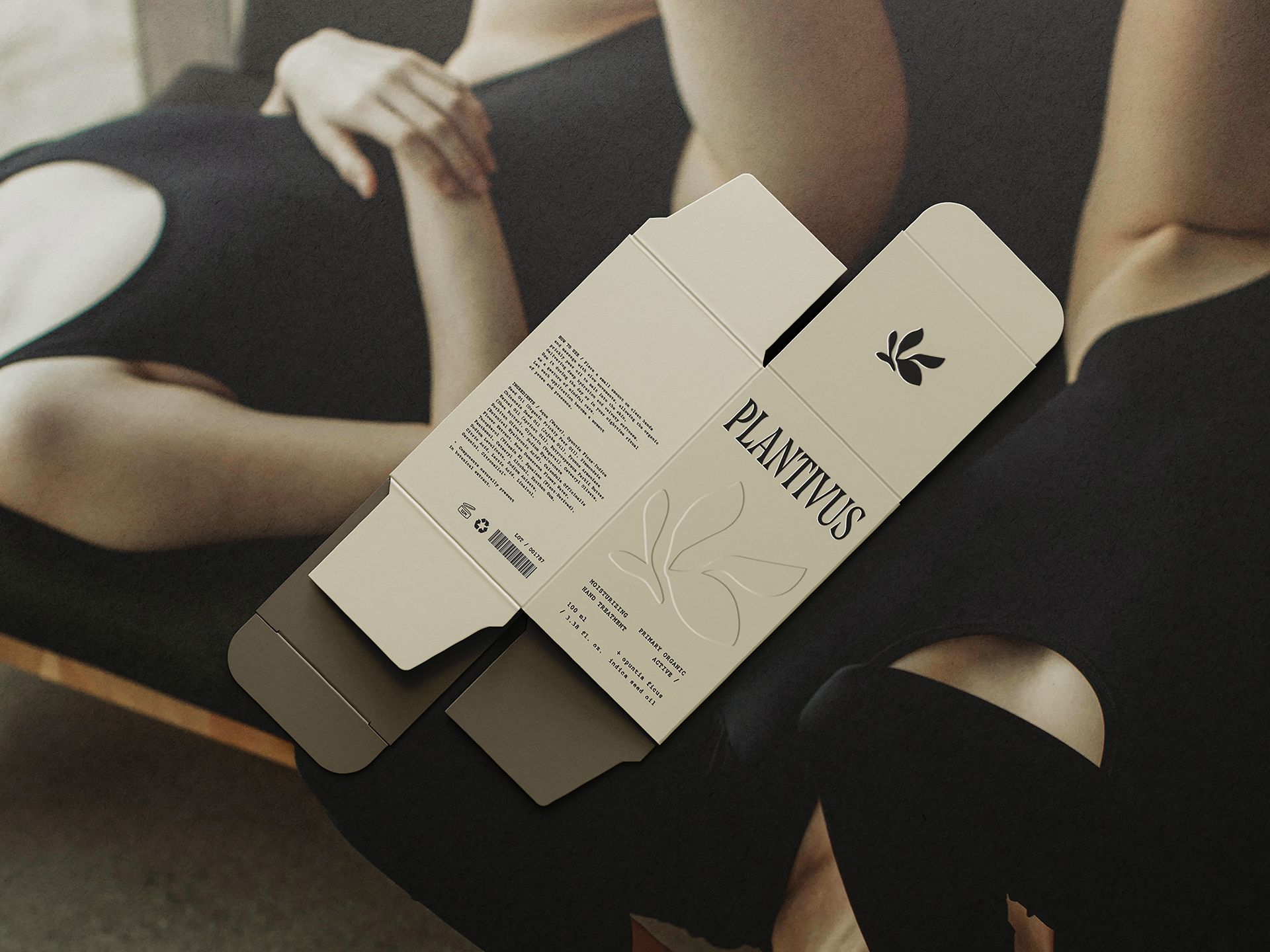
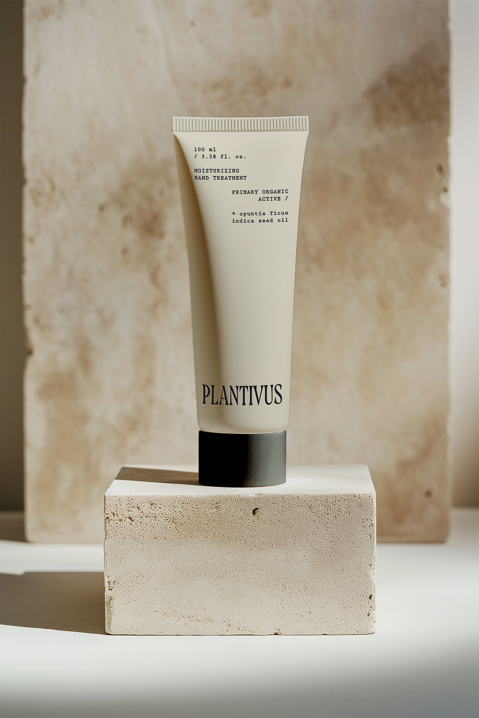
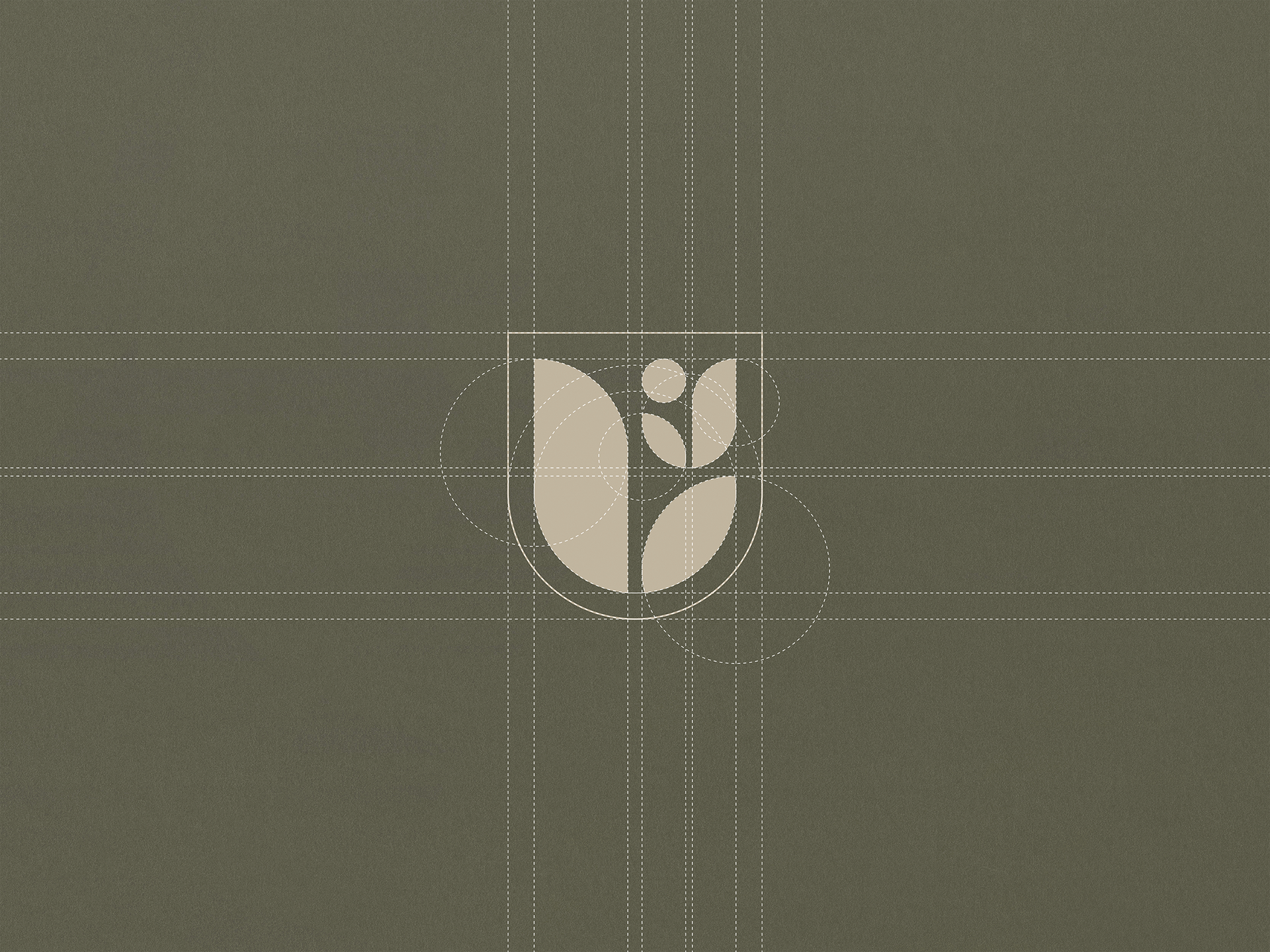
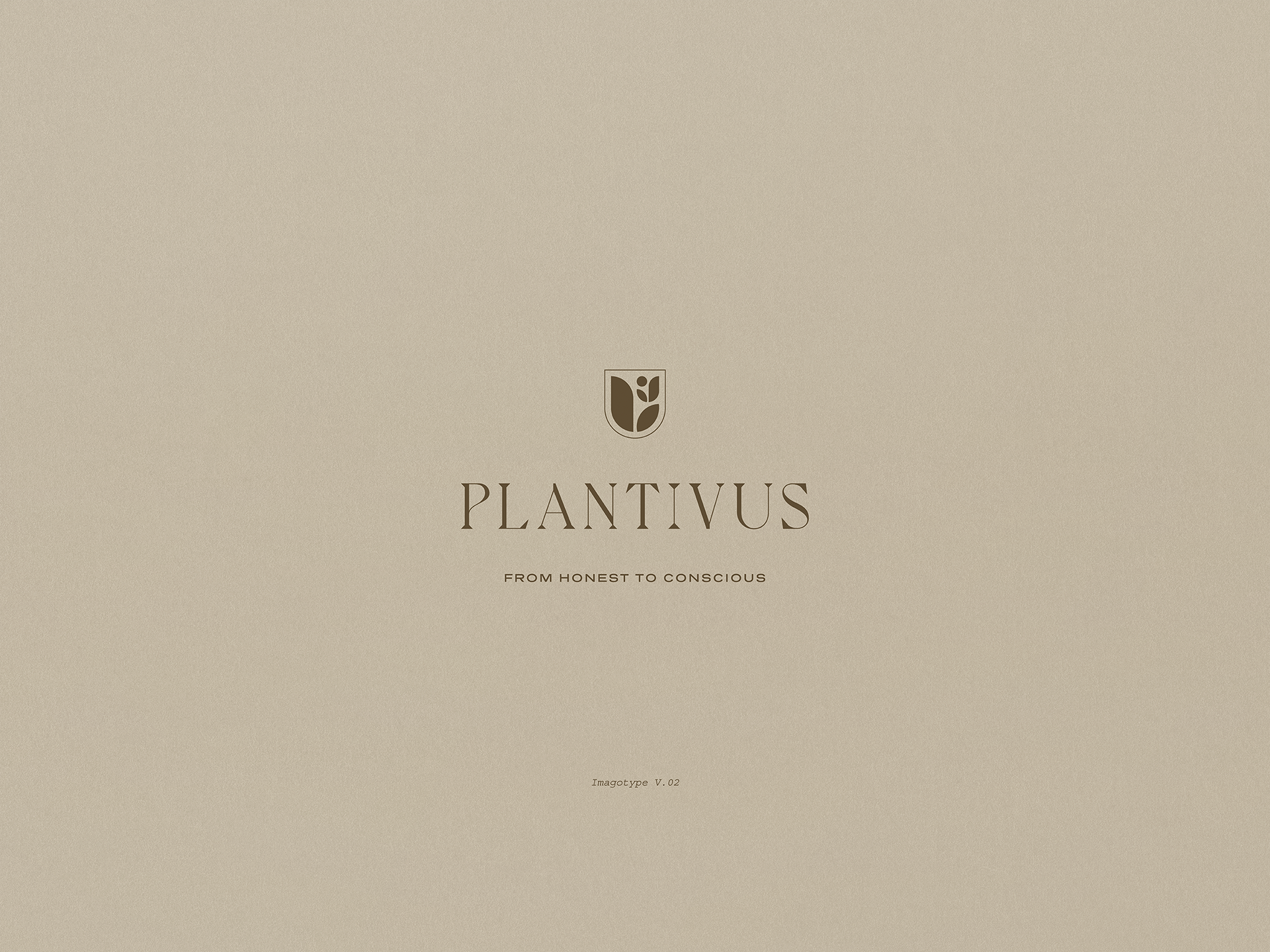
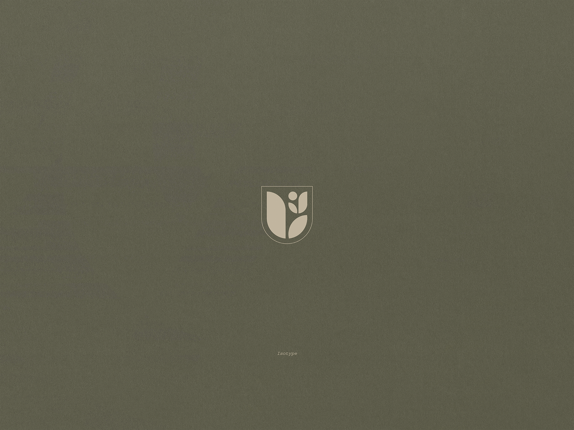
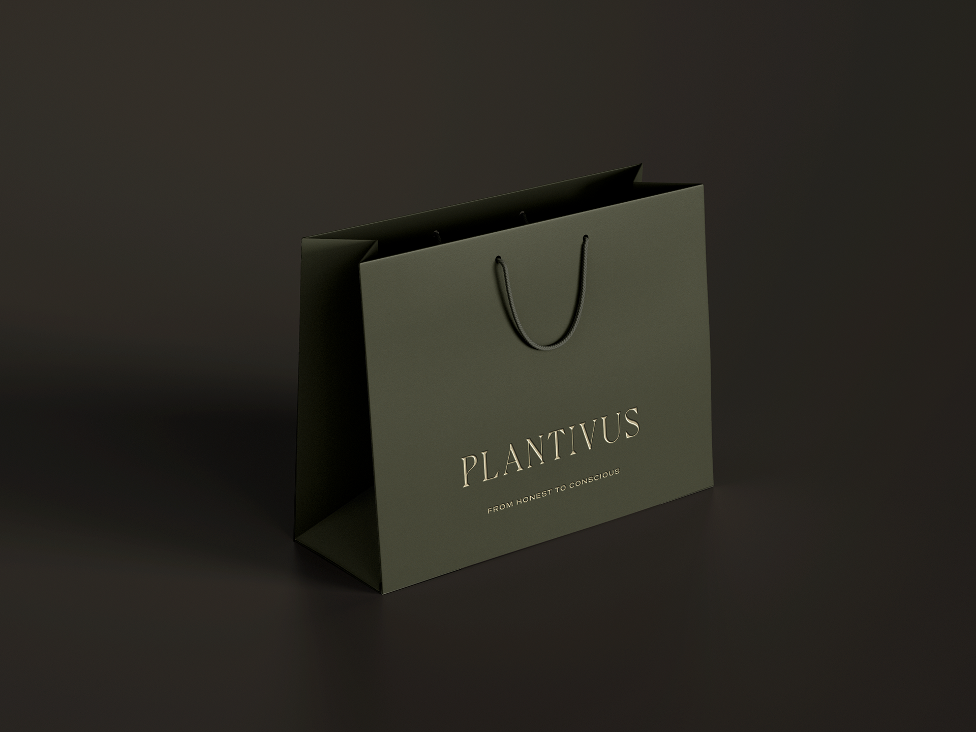
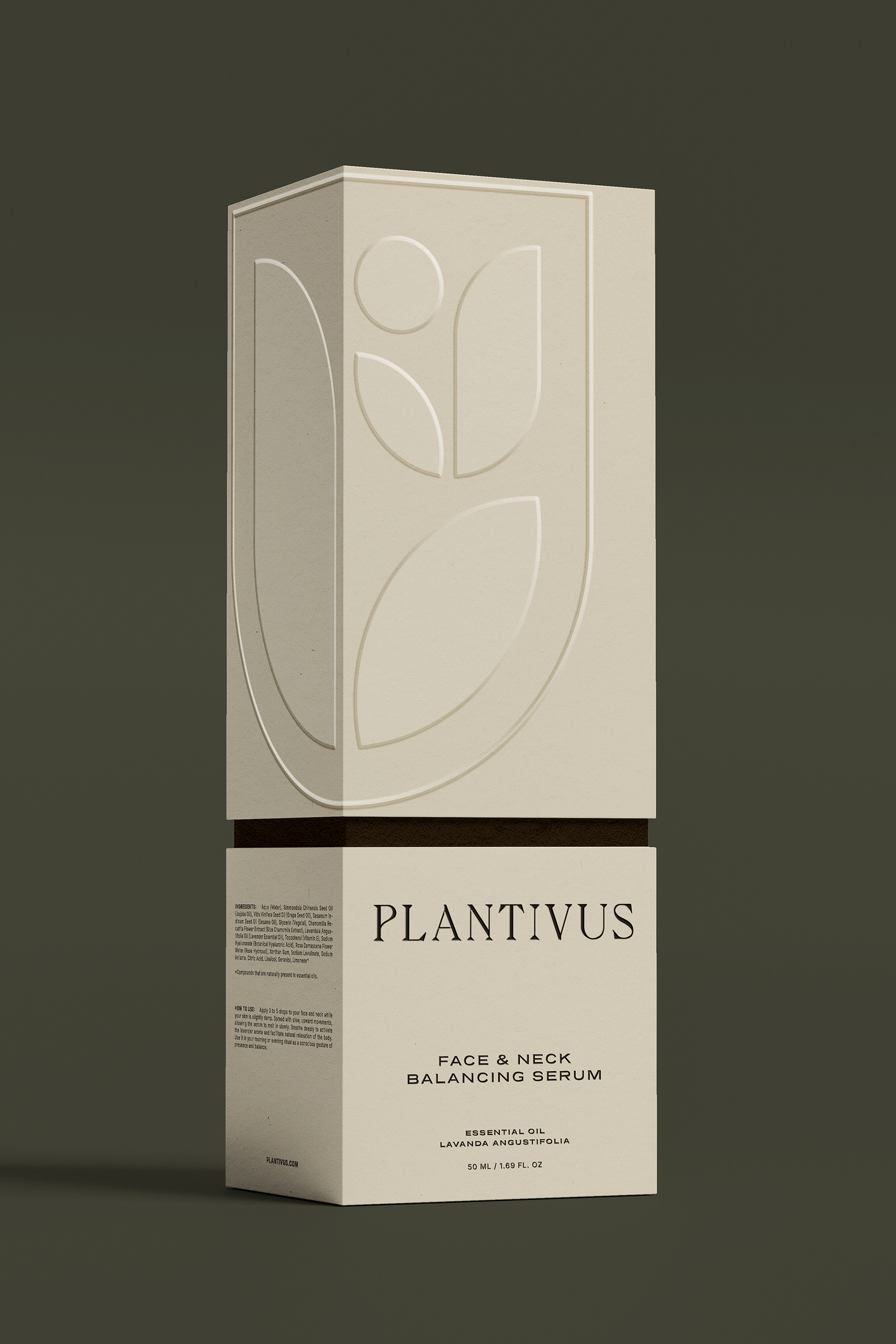
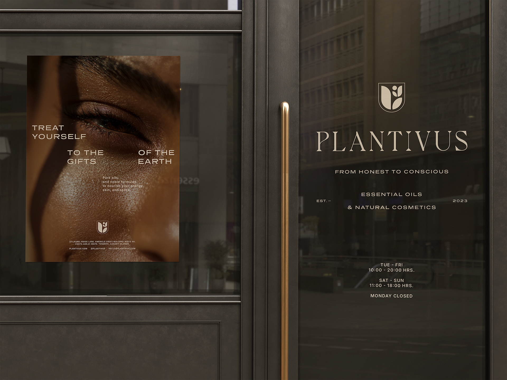
The second proposal is built on timeless elegance that transforms botanical elements into a more sober, ritualistic, and ceremonial language. The serif typeface, stylized and with fine features, conveys an almost liturgical presence that refines the perception of personal care and brings it closer to the realm of conscious worship, highlighting it with a discreet elegance that does not compete with nature, but rather frames it. The isotype—a flowering plant contained within a shield—functions as a metaphor for physical and spiritual protection, encapsulating the idea of preserving profound beauty. This union between the natural and the heraldic gives the brand a sacred dimension, linked to tradition and calm. It also reinforces Plantivus' narrative as a guardian of pure, slow, and essential processes. The entire system dialogues with a sense of well-being that is built from within. The result is a sophisticated identity that honors nature as a legacy to be cared for and respected.
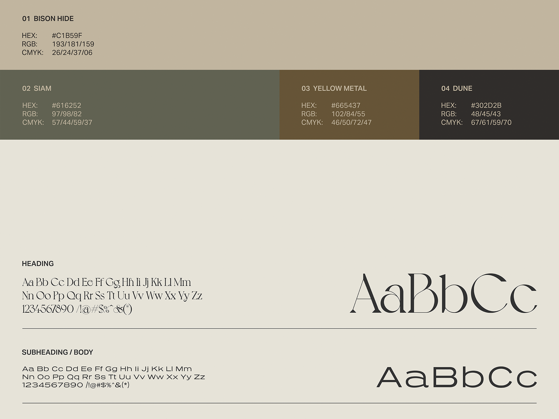
The color palette—Bison Hide, Siam, Yellow Metal, and Dune—deepens this narrative through earthy, mineral, and deep green tones that evoke an organic and quiet refinement. Its warm and stable atmosphere suggests permanence, heritage, and continuity, key elements for a brand that embraces the essential as a philosophy of life. These colors connect with the leisurely pace of natural rituals, where each transformation occurs with intention and without haste. The contrast between the vegetal and the mineral strengthens Plantivus' position as a bridge between science, tradition, and spiritual sensitivity. In this way, this visual proposal constructs a complete universe that feels protected, authentic, and sacred.

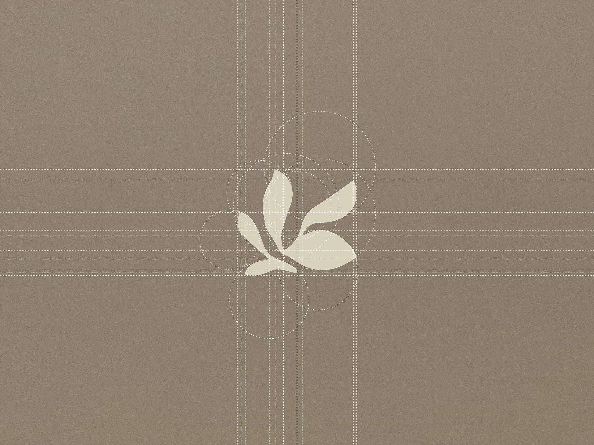
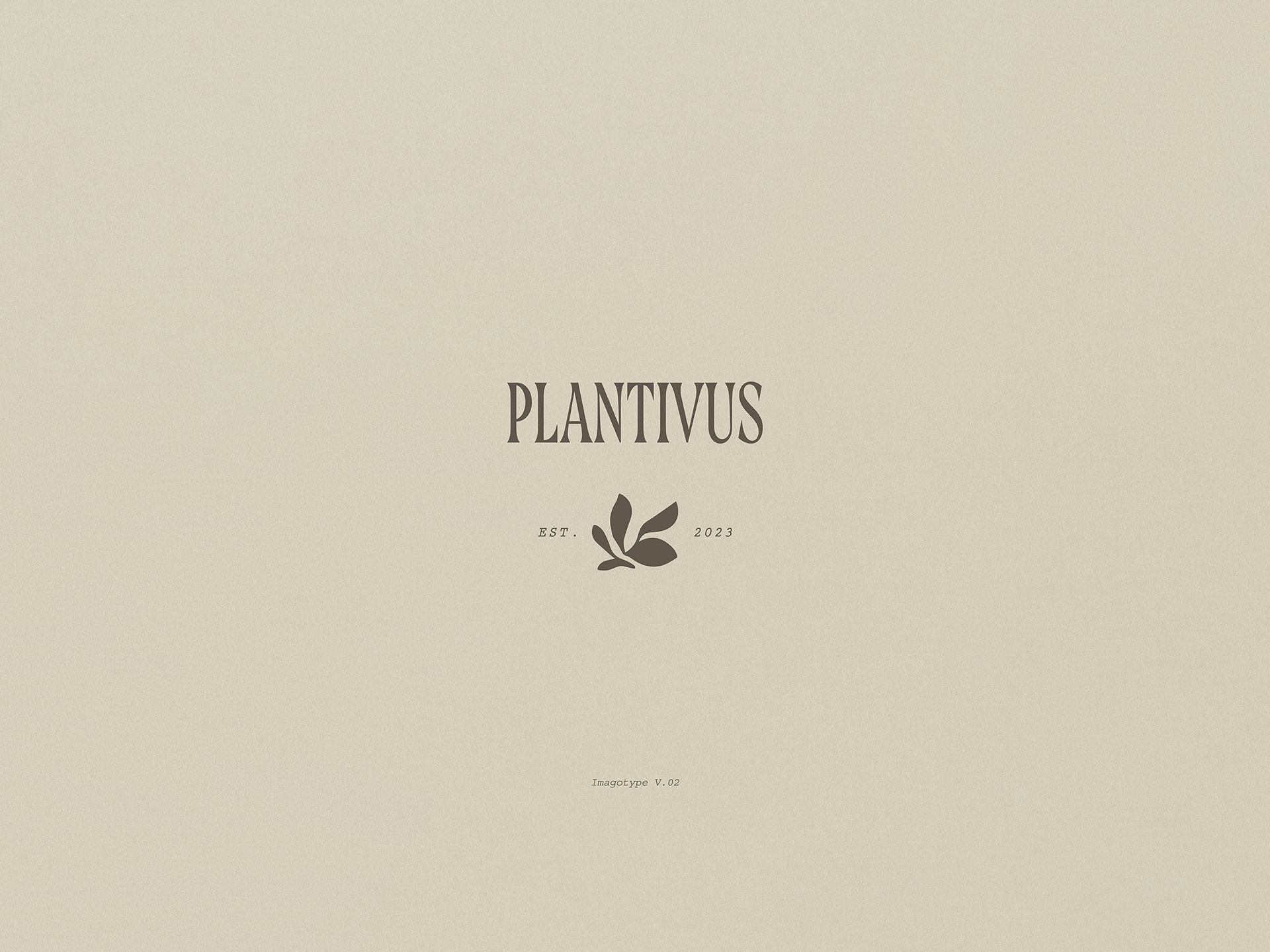
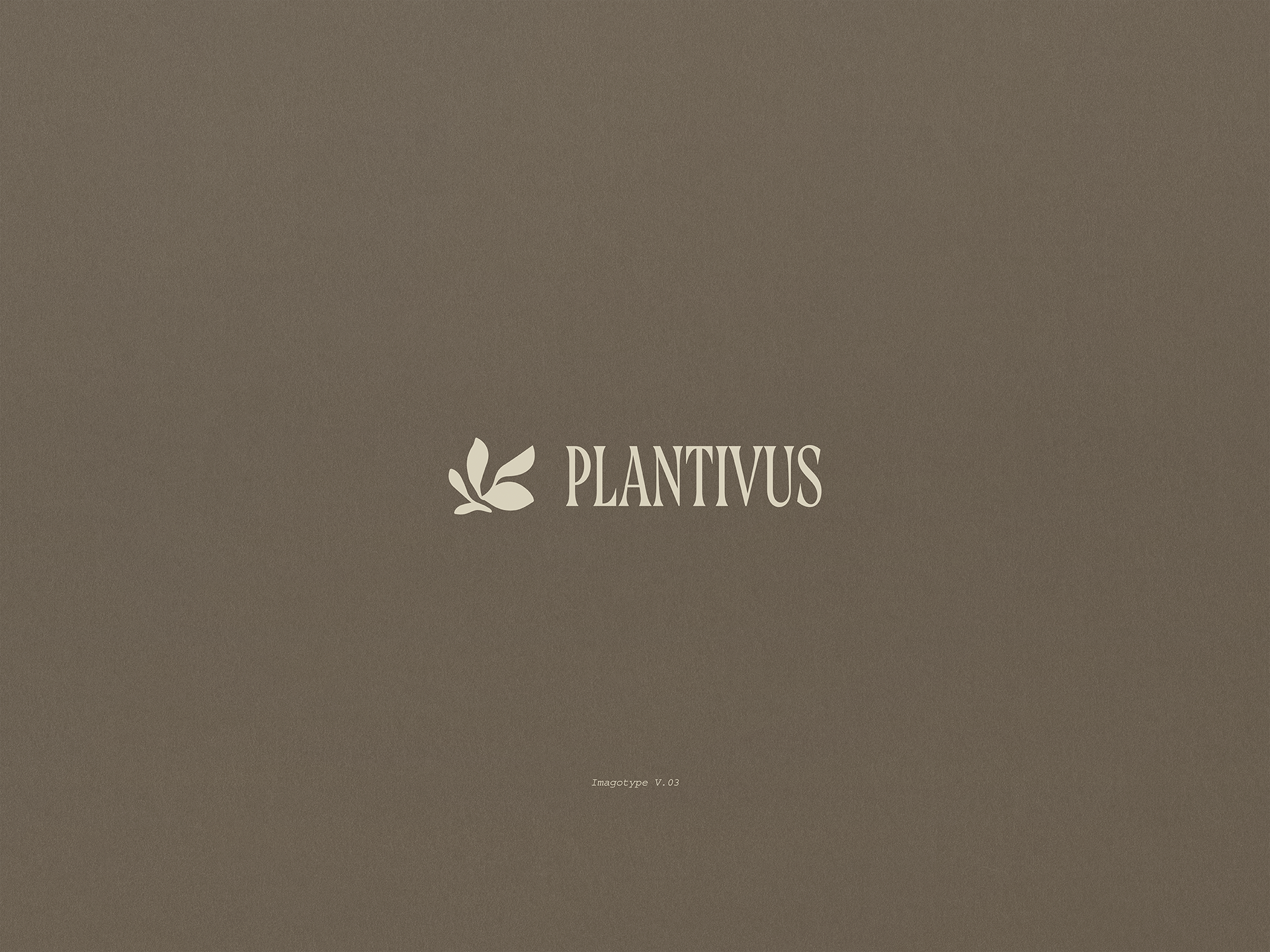
The third proposal embraces the fluidity of organic forms as a metaphor for inner awakening: a gentle, natural movement that reflects the way well-being is born and expands from the inside out. The serif typeface, with its extended height and reduced width, conveys a sense of spiritual elevation and restrained elegance reminiscent of the verticality of young stems. This typographic design generates a delicate yet firm presence, evoking a beauty that is sustained by the essence. The isotype, drawn freehand, seeks to create a fusion between the visible and the invisible, representing petals that seem to move and, at the same time, the subtle hint of a fragrance in the air. Its gestural character gives the identity a human, intimate, and sensory spirit. In this way, the proposal constructs a language that breathes conscious naturalness. Plantivus is thus projected as a refuge where well-being is expressed through soft and authentic forms.
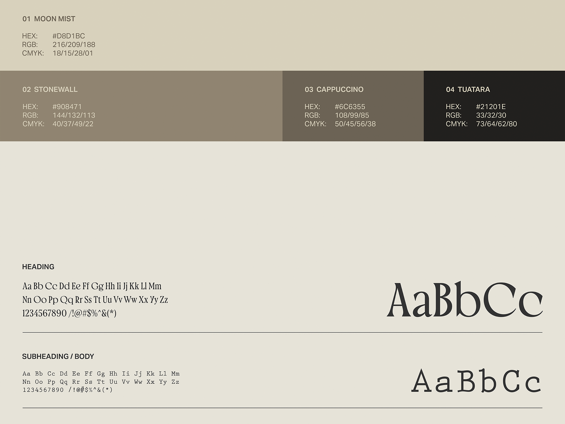
The color palette—Moon Mist, Stonewall, Cappuccino, and Tuatara—reinforces the intention to create a warm, serene universe rooted in the earth. Its shades of beige, taupe, and mineral browns evoke the feel of clay, the shade of dry leaves, and the subtlety of a cloudy sunrise, reinforcing the slow aesthetic that characterizes the brand. This color spectrum complements the gesture of the isotype, allowing its organic form to breathe without fanfare. At the same time, it enhances the stylized typography, whose contrast is delicately integrated into each application. The combination creates a visual environment that feels intimate, meditative, and deeply human. In doing so, this latest proposal honors nature through simplicity, detail, and contemplation.