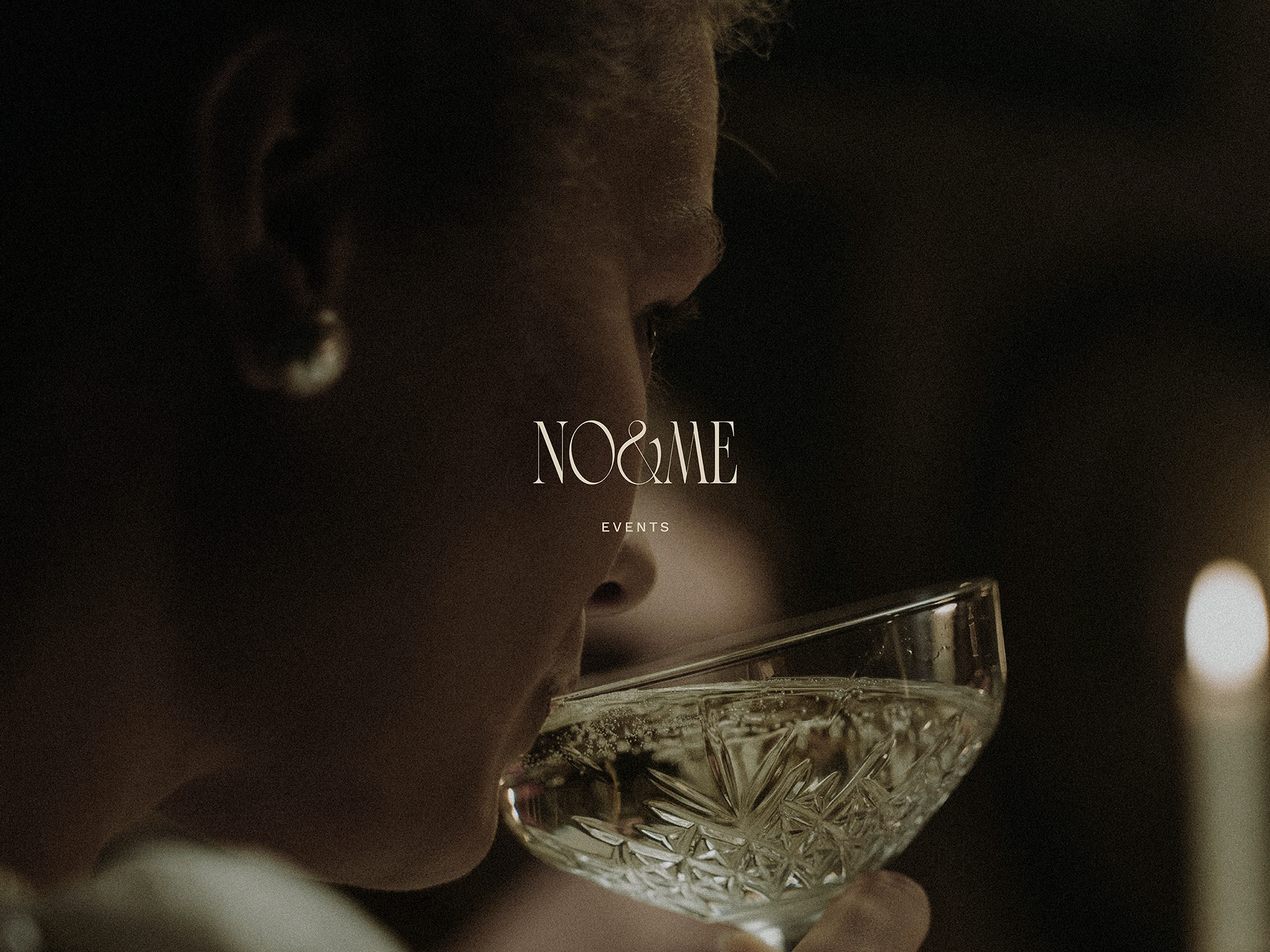
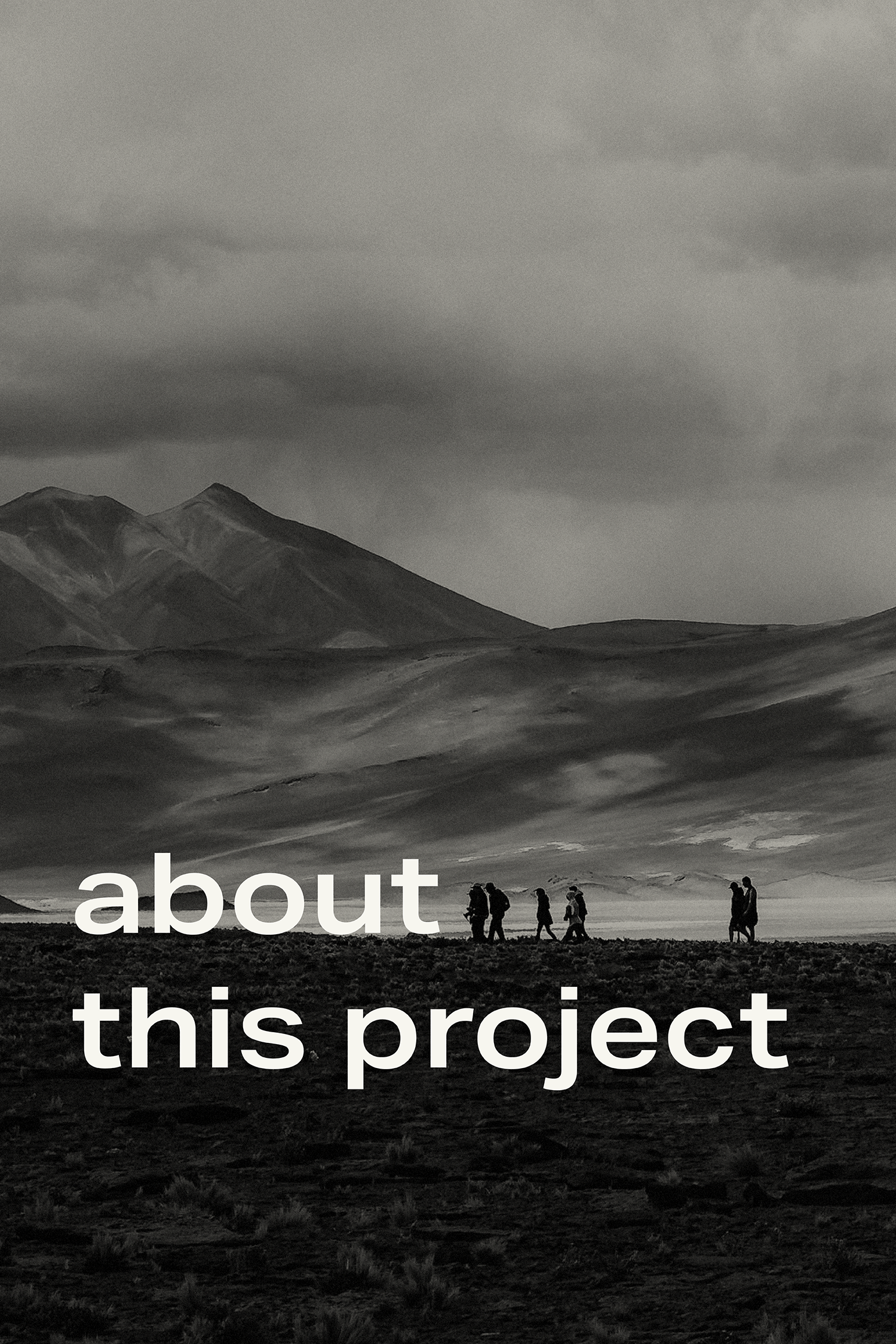
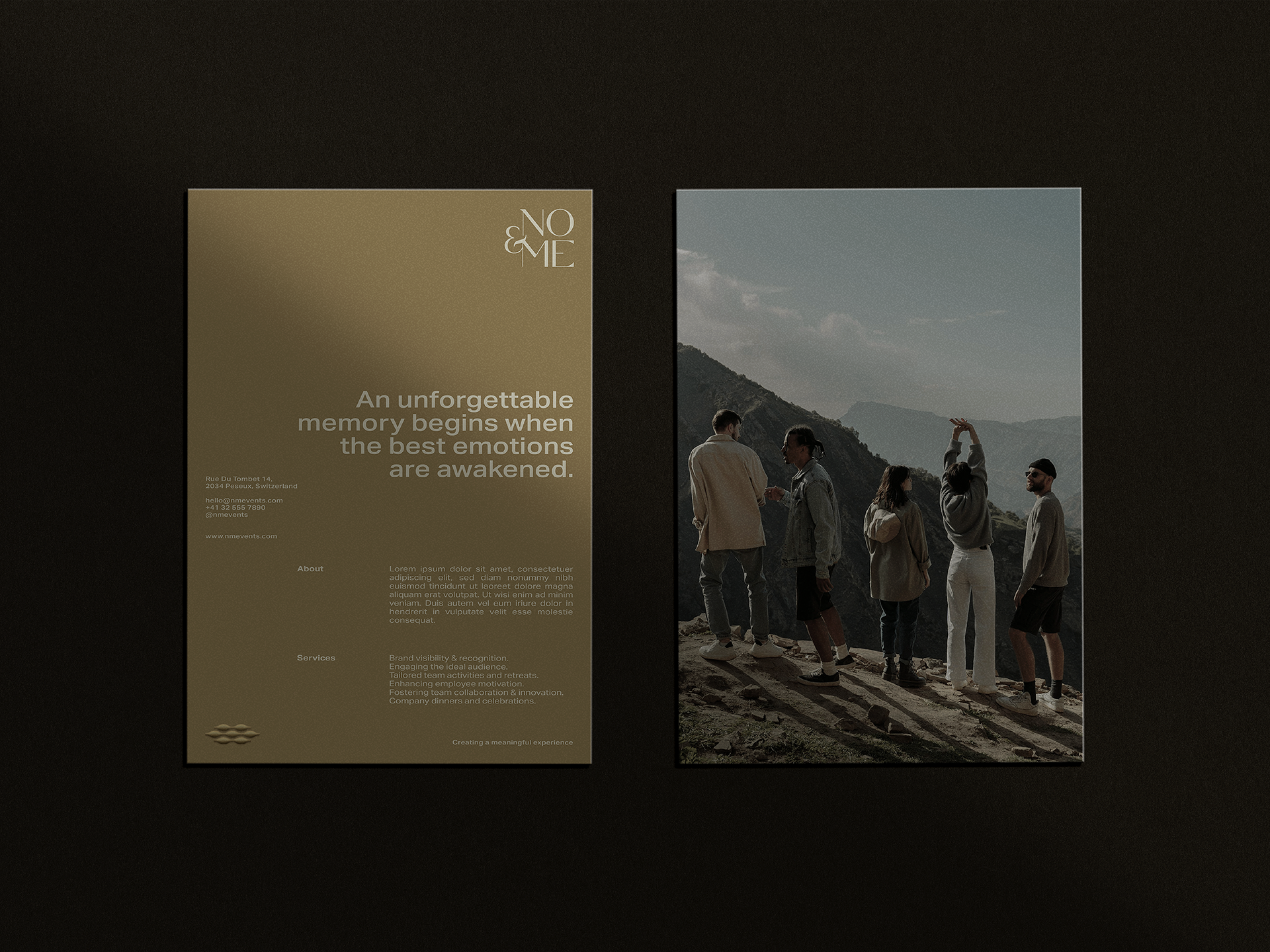
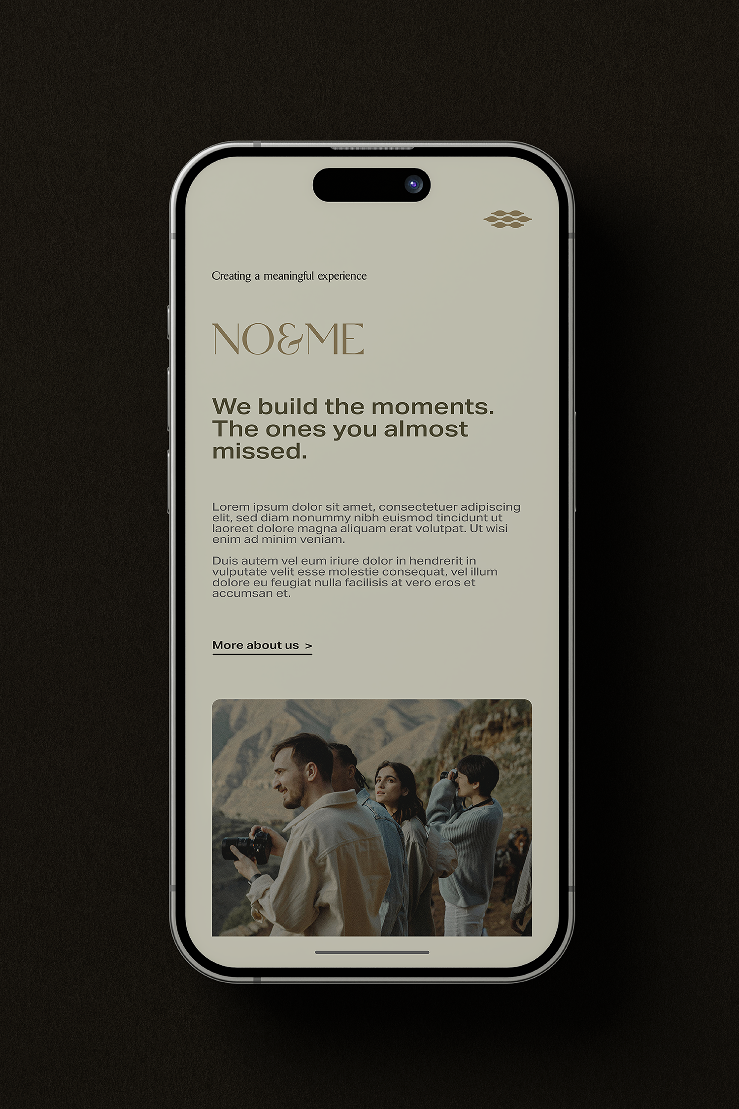
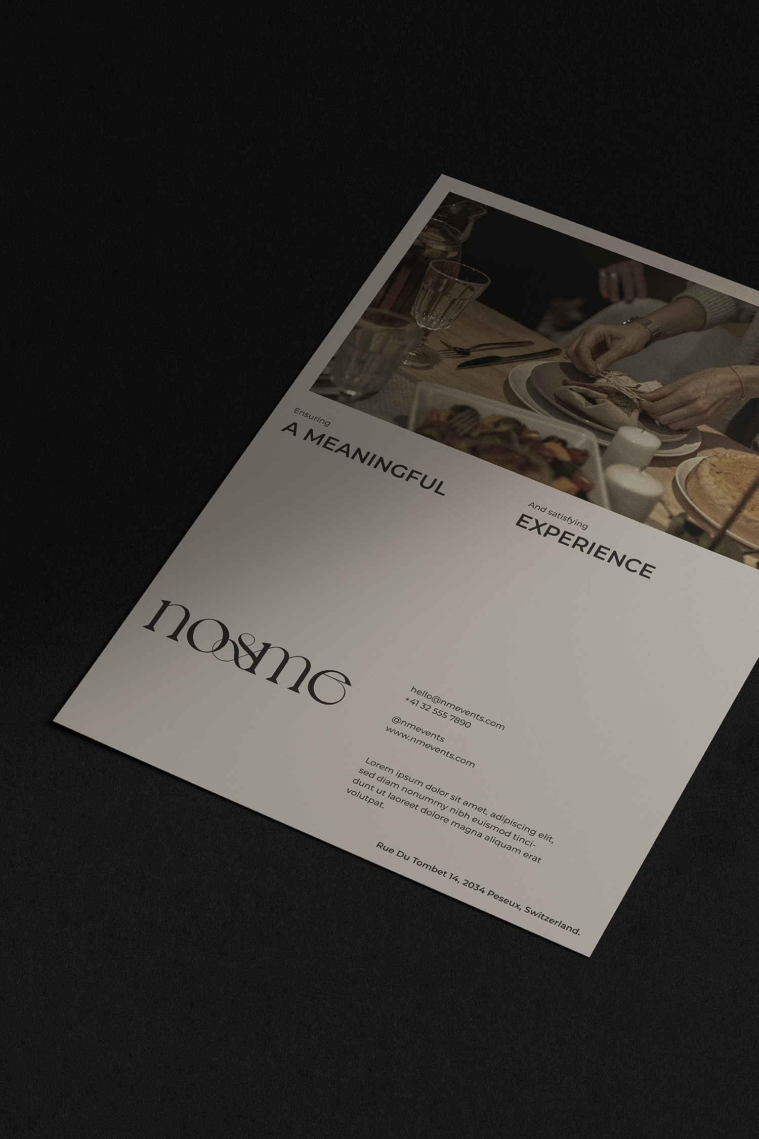
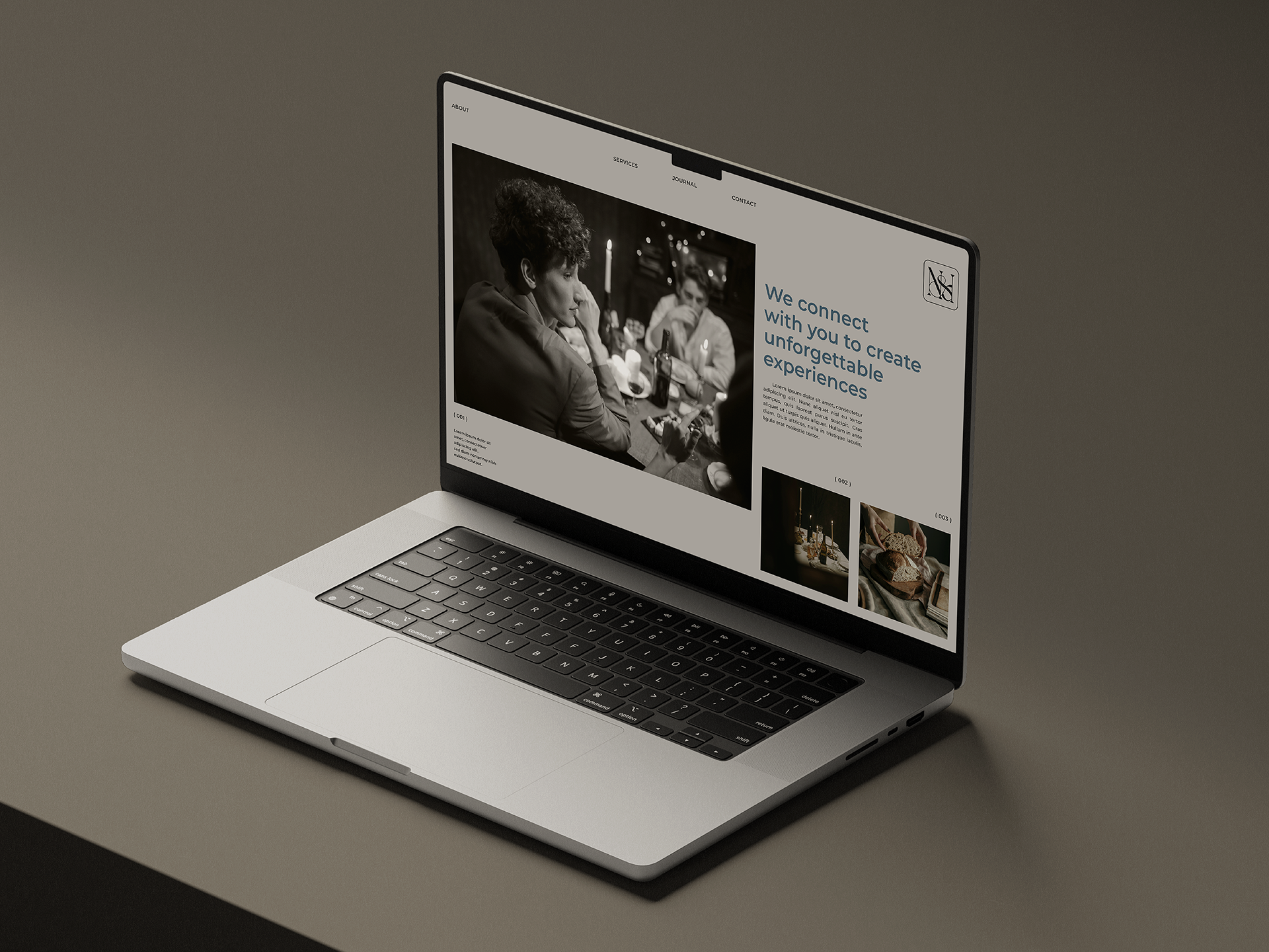
Noémie Membrez is an entrepreneur specialized in International Event Management, currently based in Peseux, Switzerland. Thanks to her studies and life experience, Noémie decided to open a space in the corporate event services sector by creating her brand No&Me, whose mission is to empower each member of a company through exceptional events that strengthen human values at the individual, collective and work levels, increasing motivation and contributing to the overall success of organizations.
Noémie is convinced that spreading happiness through the value of interpersonal relationships creates a deep connection with its customers and users; therefore, it strives to be the most professional and reliable brand to help them. Using the knowledge, experience, tools, and contacts that have worked for her over the years; Noémie guarantees that each of her events will generate a positive transcendental impact, firstly at a personal level, secondly at a group level, and thirdly at an organizational level.
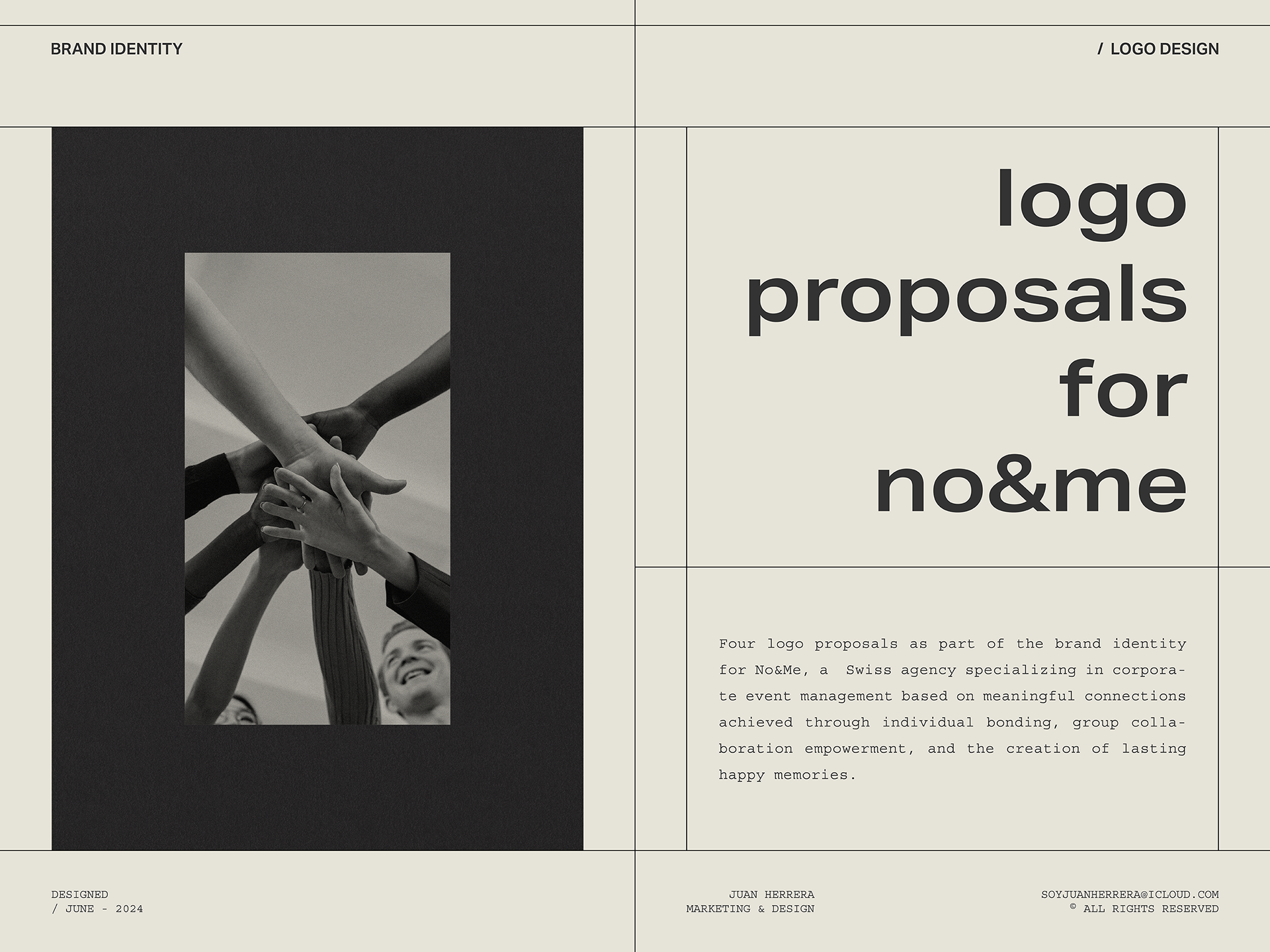
Noémie's need to have the support of a professional image that conveys the essence and values of No&Me led her to ask me to develop a series of logo proposals that would allow her to choose what would be the first identifying link of the brand. The conceptualization of each of them is based on key elements that are inherent to No&Me and that seek to endure over time through its graphic image.
The four logo proposals included in this project are the second part of a series of actions related to the construction of the No&Me brand, which began with the development of its brand DNA, through which I was able to understand its essence, its personality, its identity and its reason for being, as well as other analyses that indicated how No&Me should present itself in the market to generate a positive perception and how it should relate to its audience through communication. These four proposals also seek to appeal to the Buyer Persona profiles that I defined in the brand DNA, as an accurate representation of their ideal customers. The graphic development of these proposals seeks to differentiate them from the 16 brands I have previously analyzed and currently represent a direct competition for No&Me in the Swiss territory.
Likewise, while the first two logo proposals evoke a sense of unity and teamwork, the final two proposals evoke a sense of celebration and appreciation for good company.
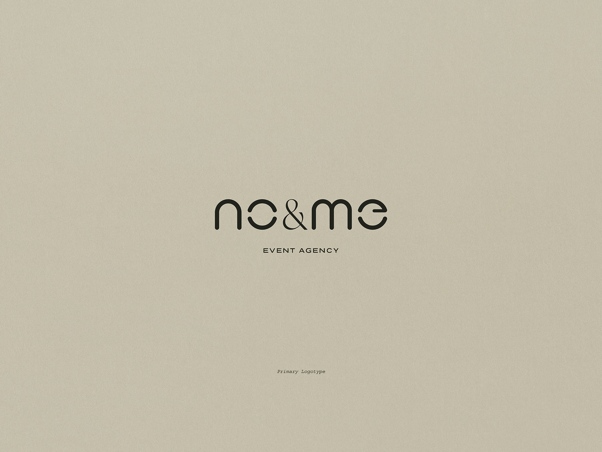
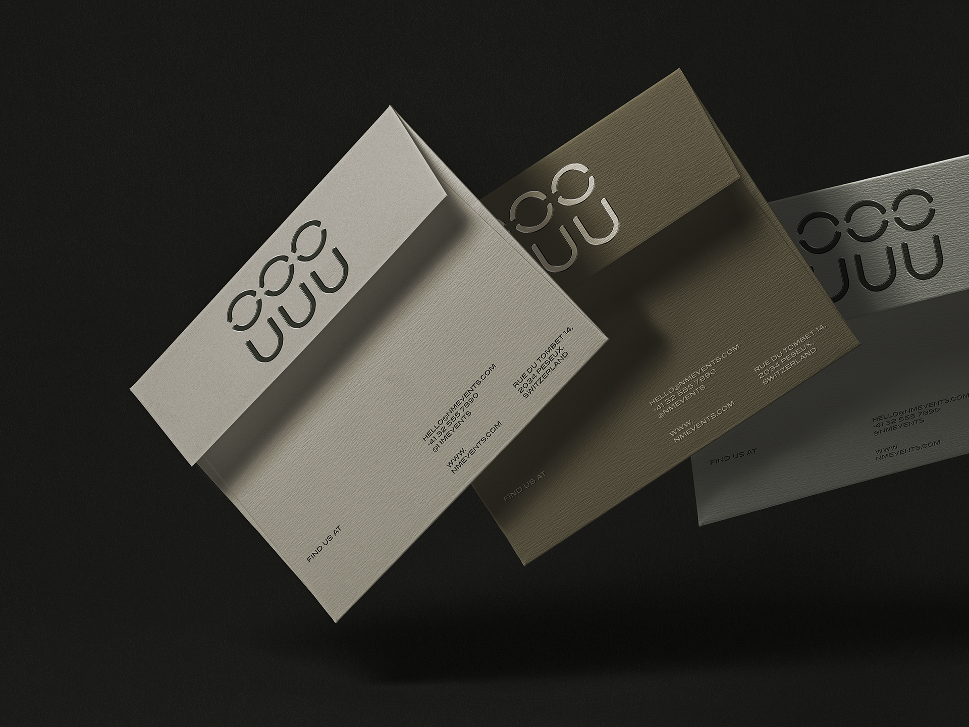
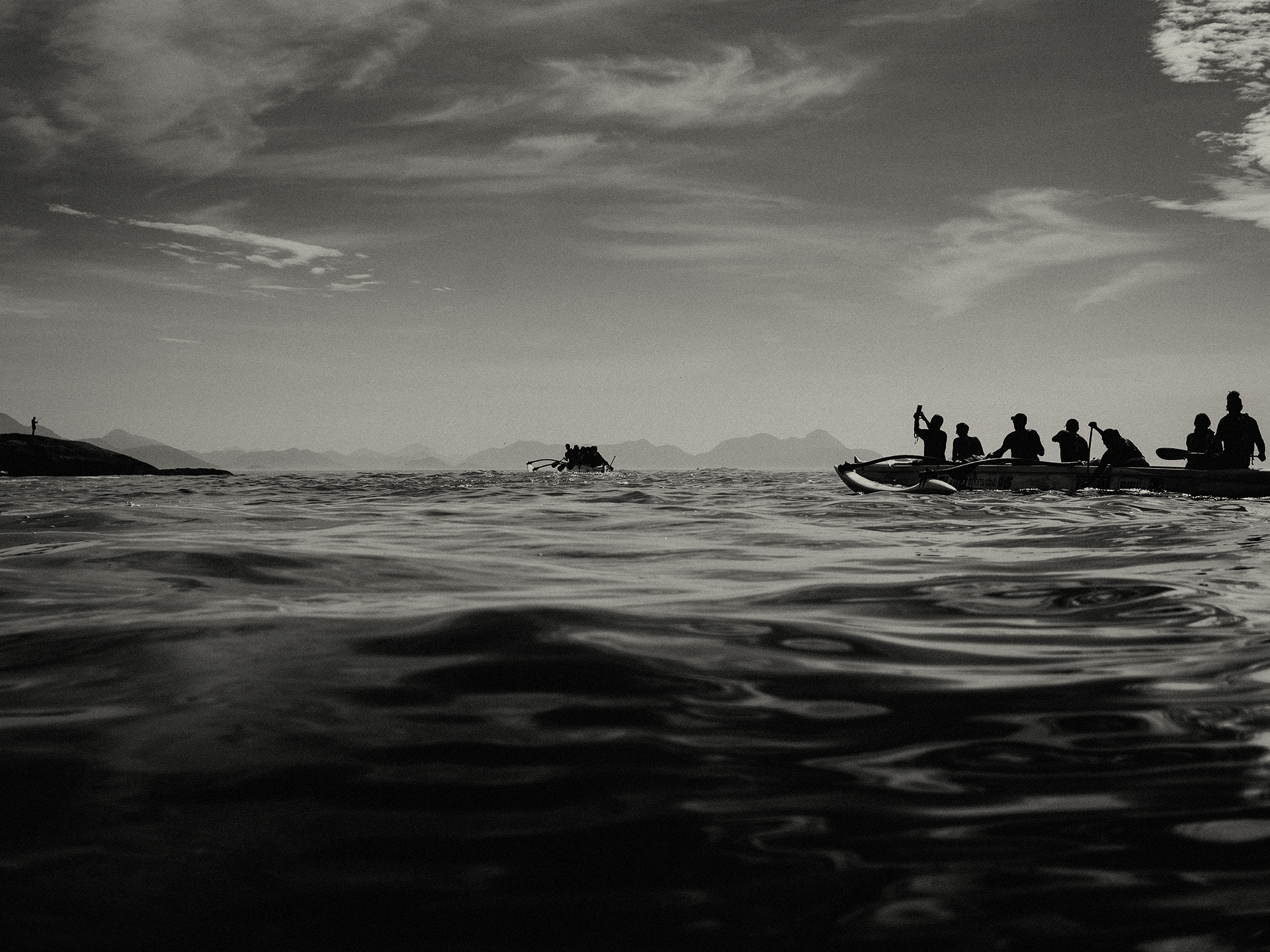
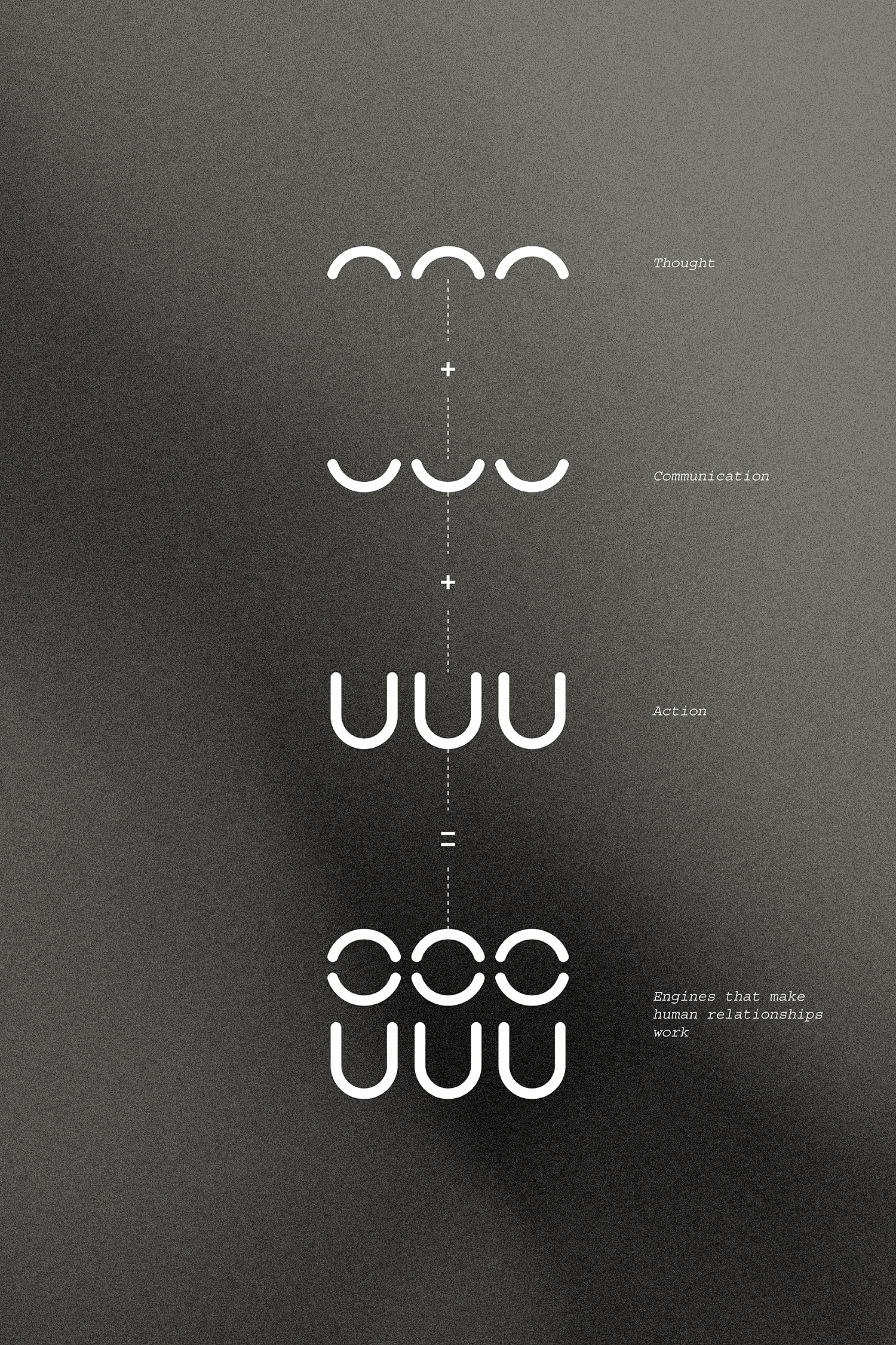
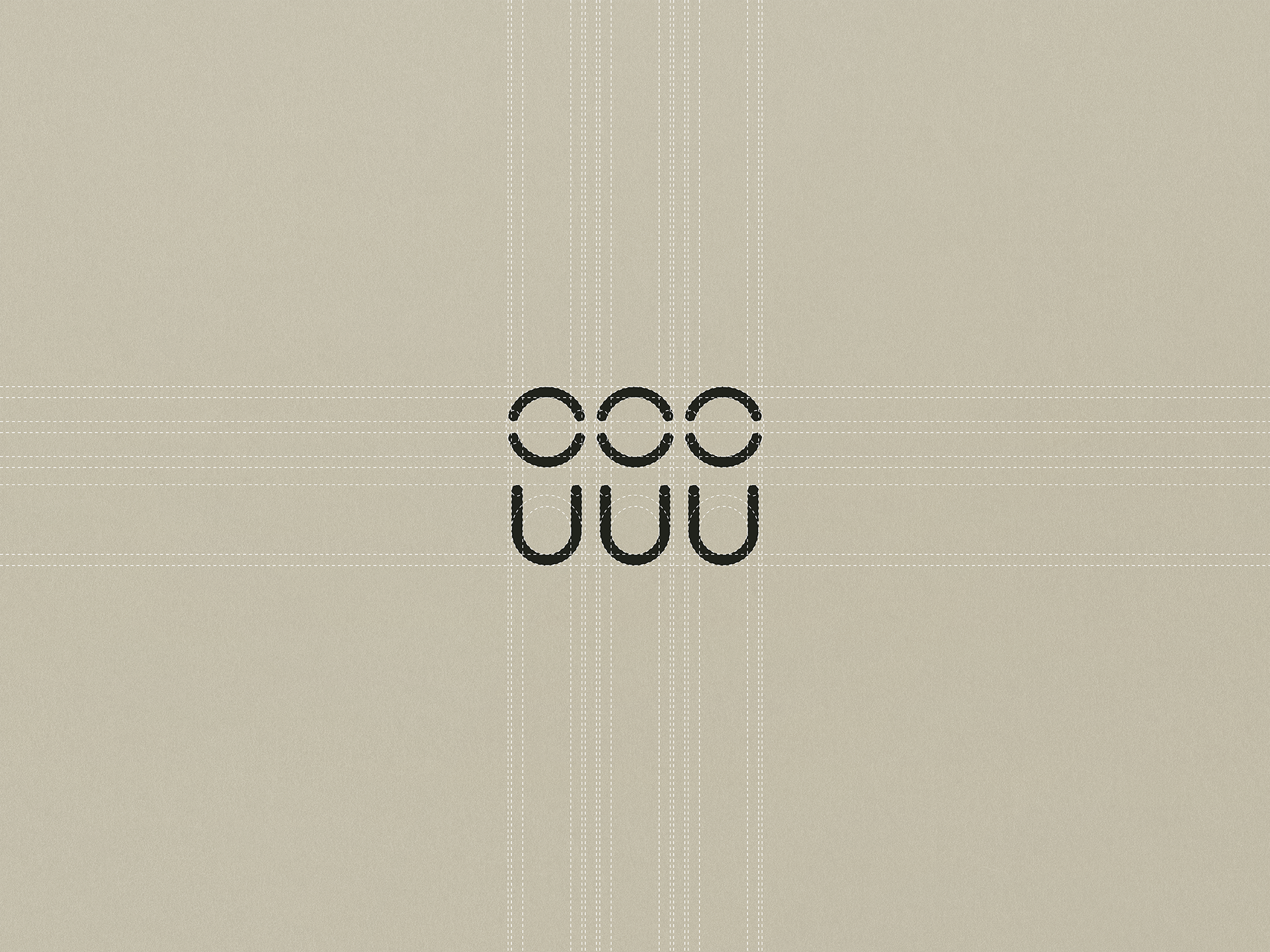
The first proposal is inspired by work teams as a representation of interpersonal relationships and as key entities to achieve a common good.
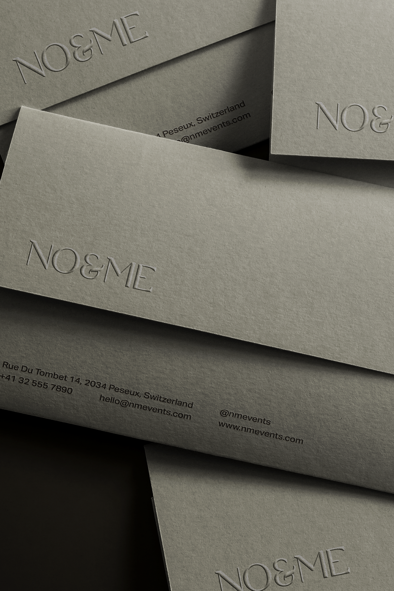
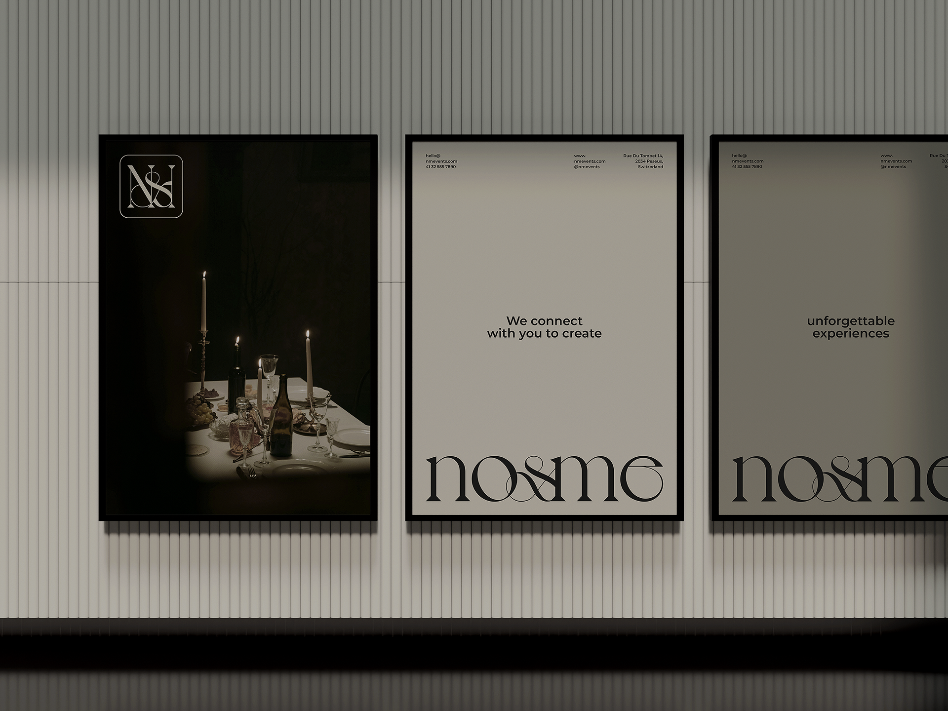
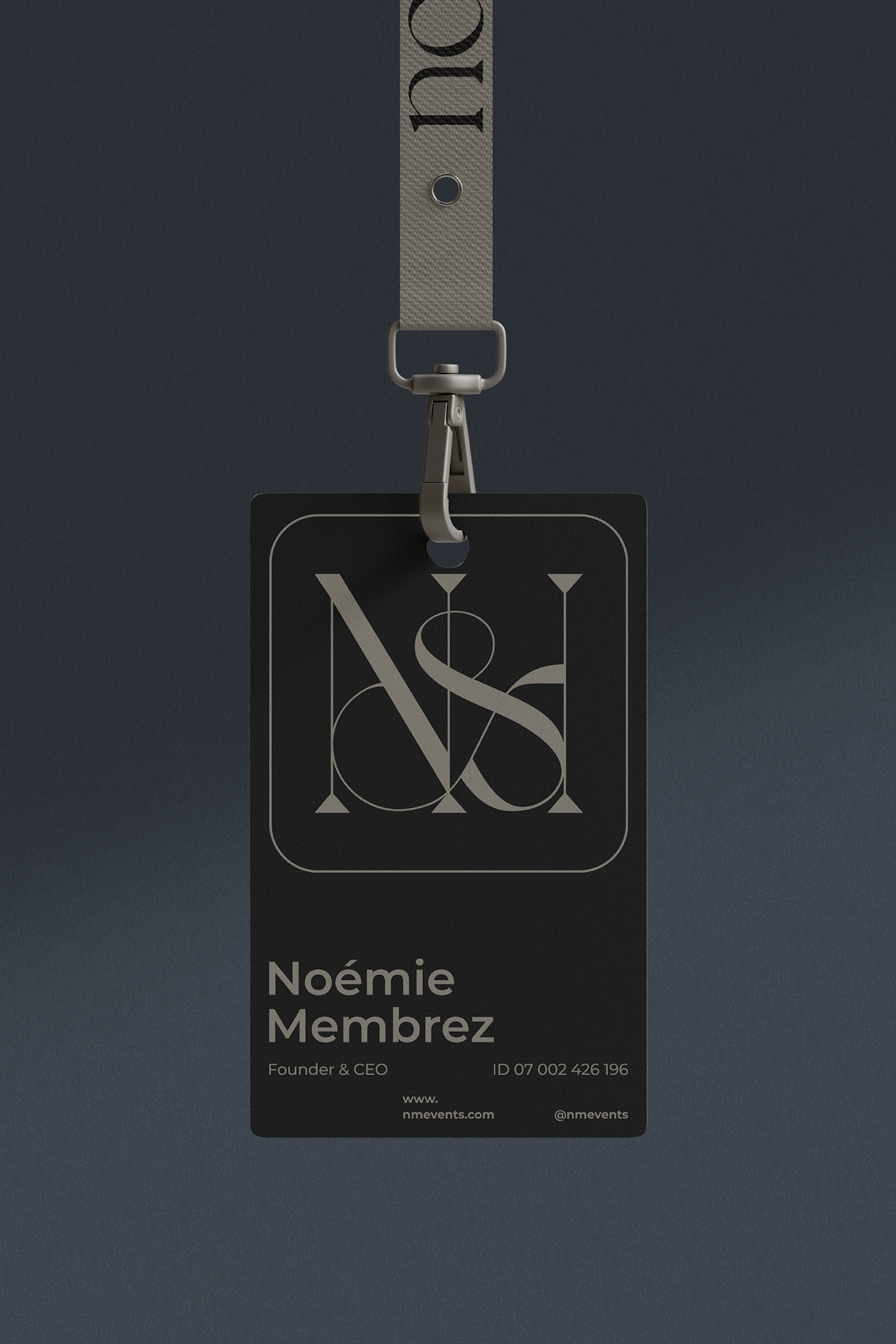
For the primary logotype, secondary logotype, and submark, I worked with a single-width sans serif typography that gives the whole a timeless, friendly, and determined character. On the other hand, the letter "&", as the distinctive element of union, implements a serif typography that gives a feminine touch in its curves and corners, subtracting uniformity from the whole.
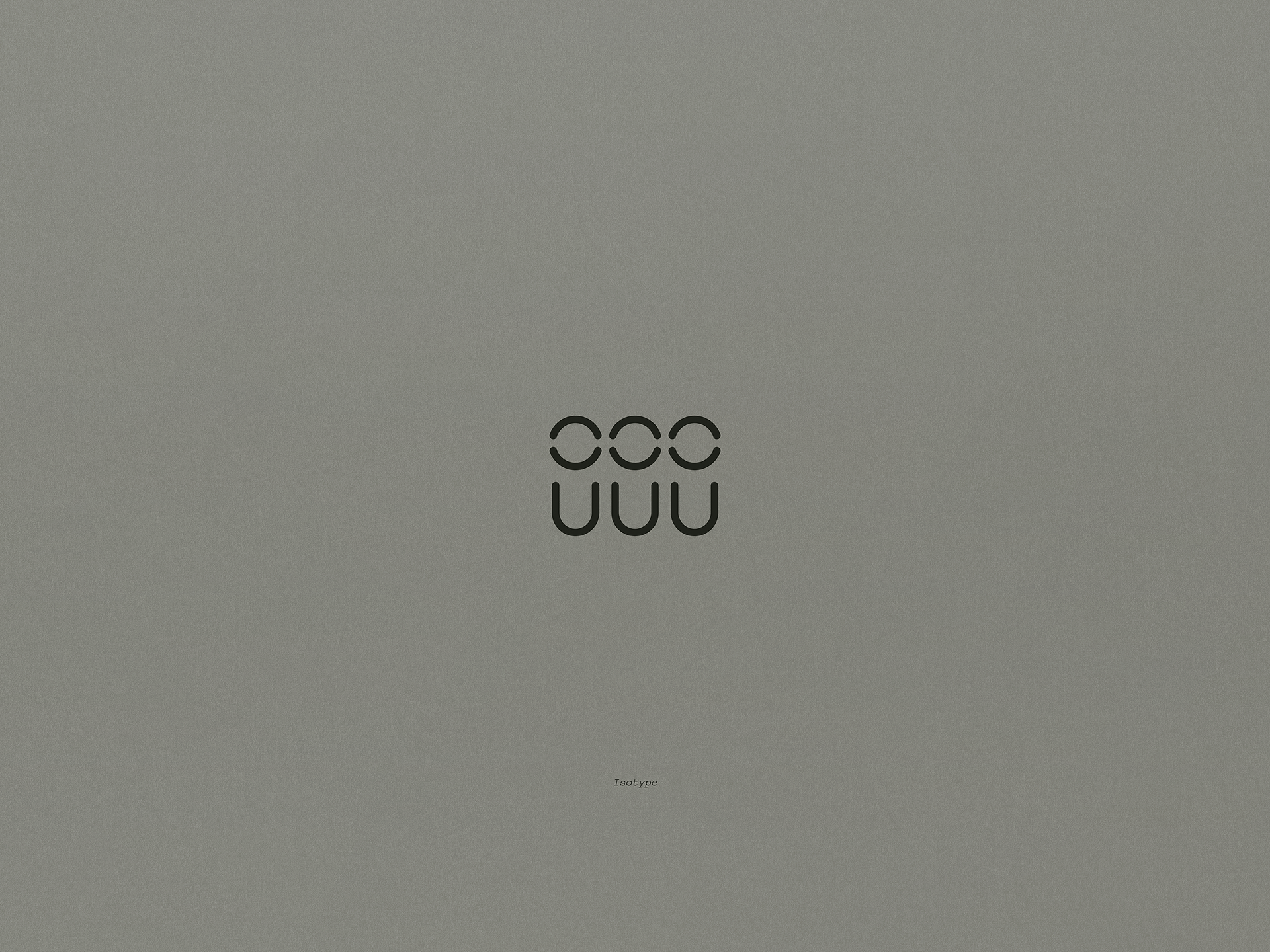
The isotype is constructed using the letters "n" and "o" from the main logo to form a simple representation of a small group of three people. The deconstruction of these symbols is a human representation composed of three elements: the upper part represents thought (mind), the central part represents communication (mouth), and the lower part represents action (body). These elements are the engines that make human relationships work.
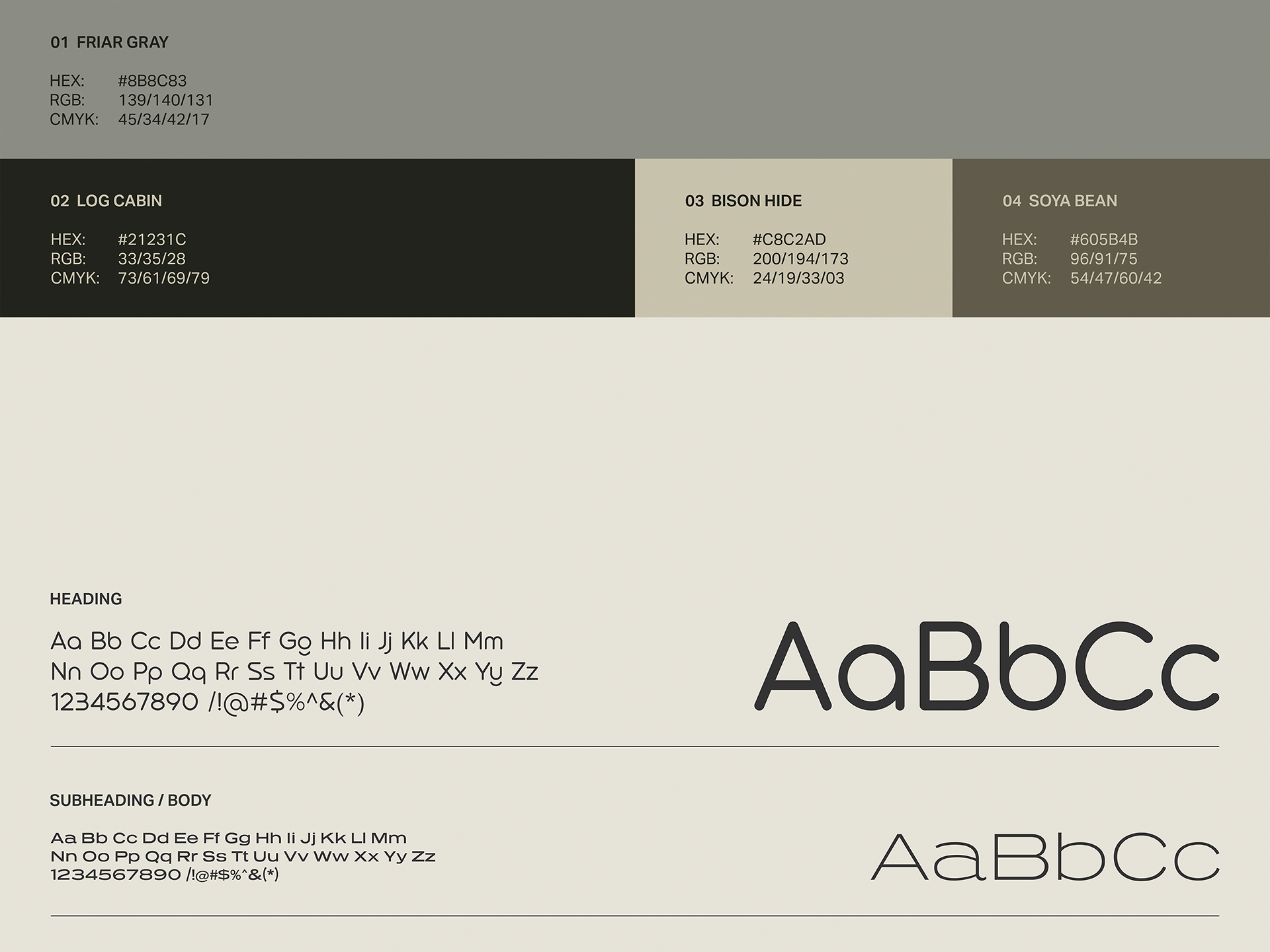
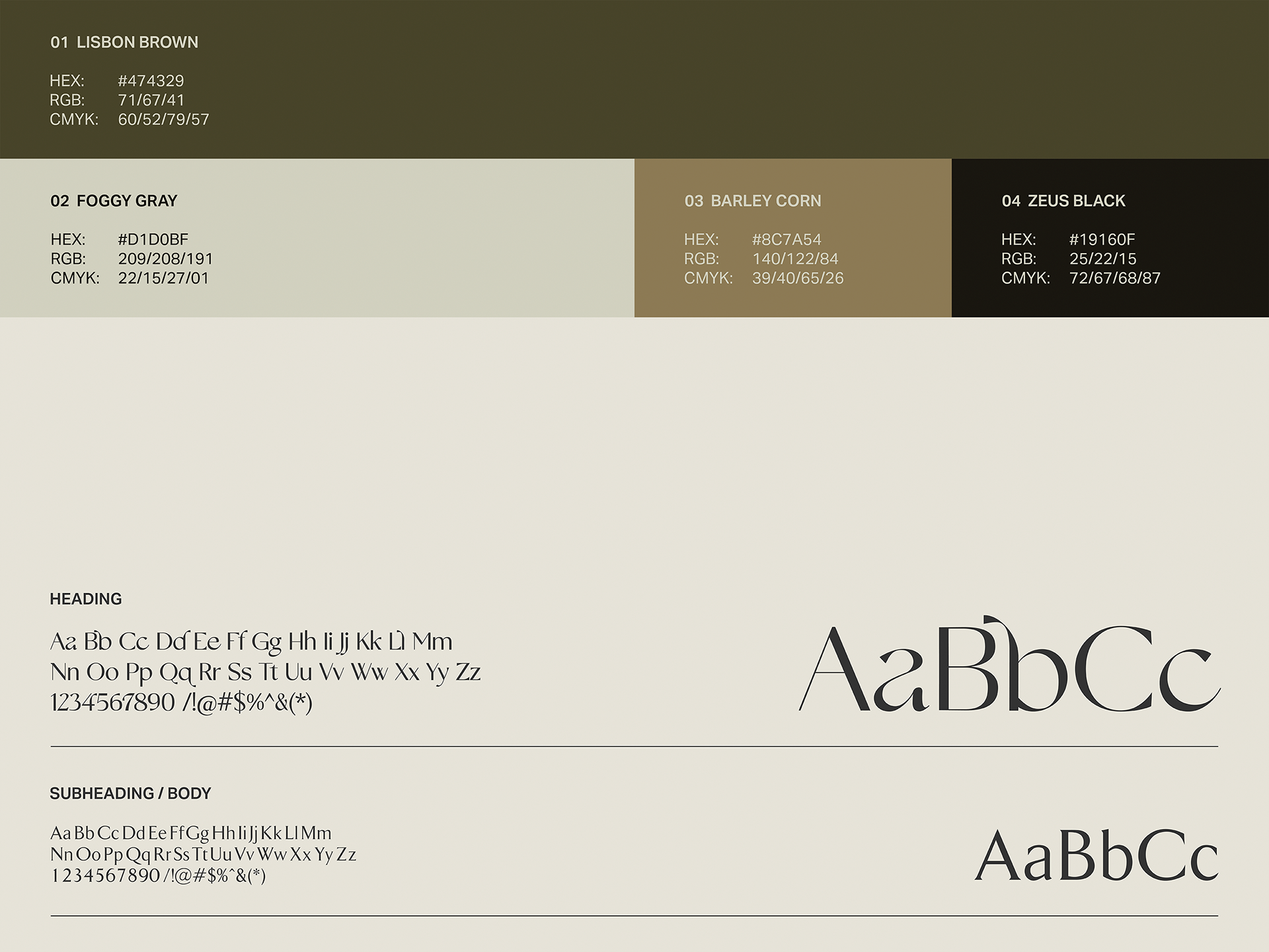
On the other hand, the color palette uses soft earth tones to convey security, tranquility, and cordiality. Friar Gray takes center stage, adding an air of knowledge and stability to the graphic ensemble.

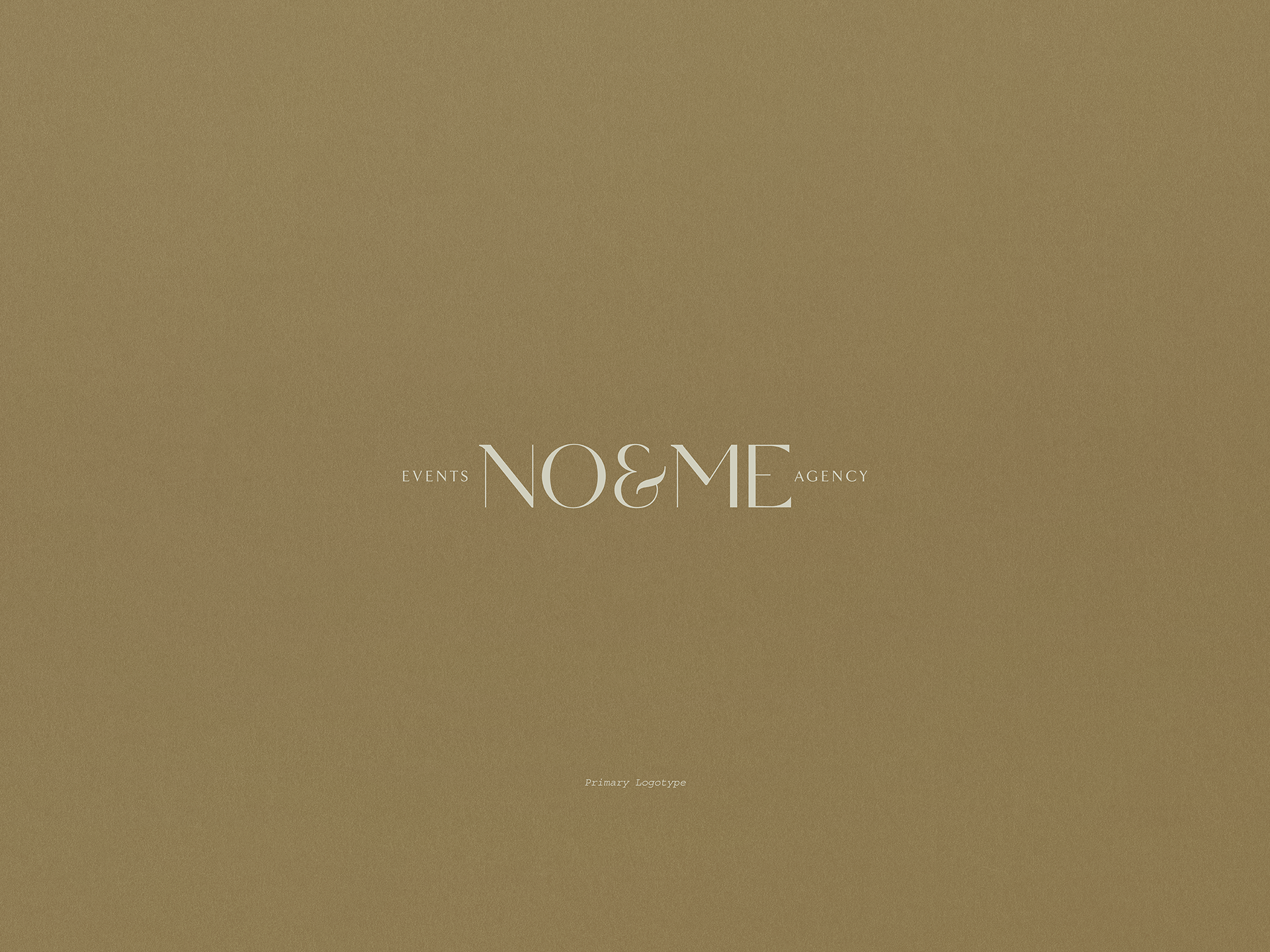
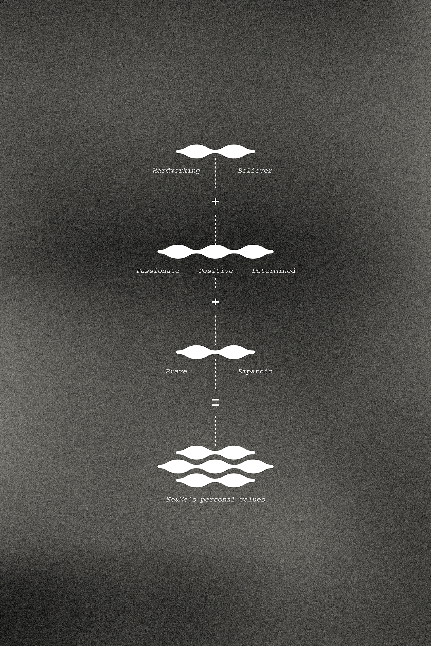
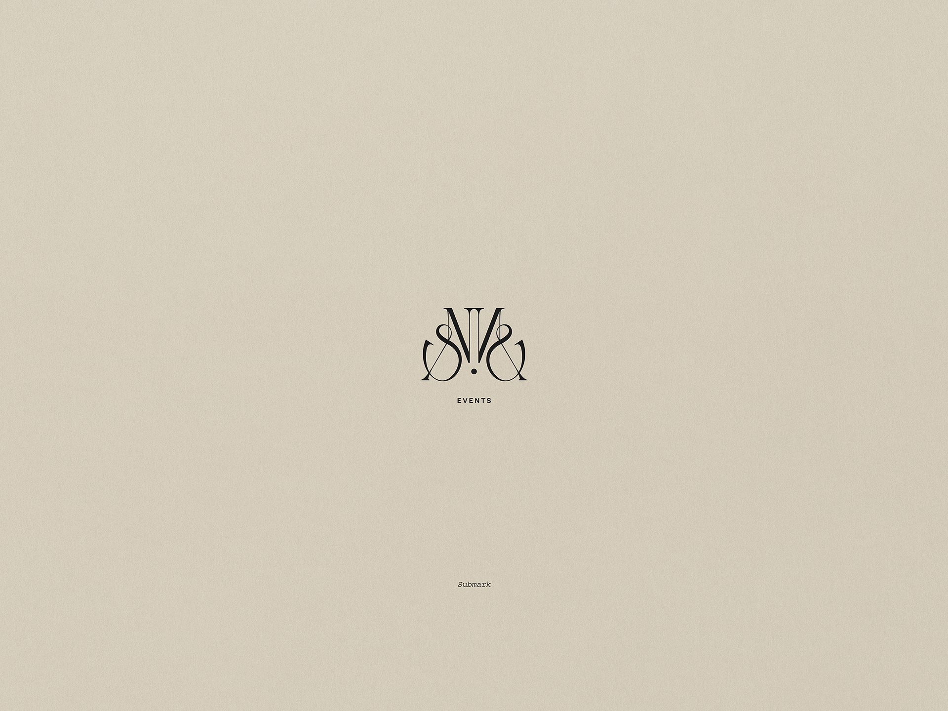
The second proposal is inspired by Noémie's set of personal values that form the identity and essence of the No&Me brand.
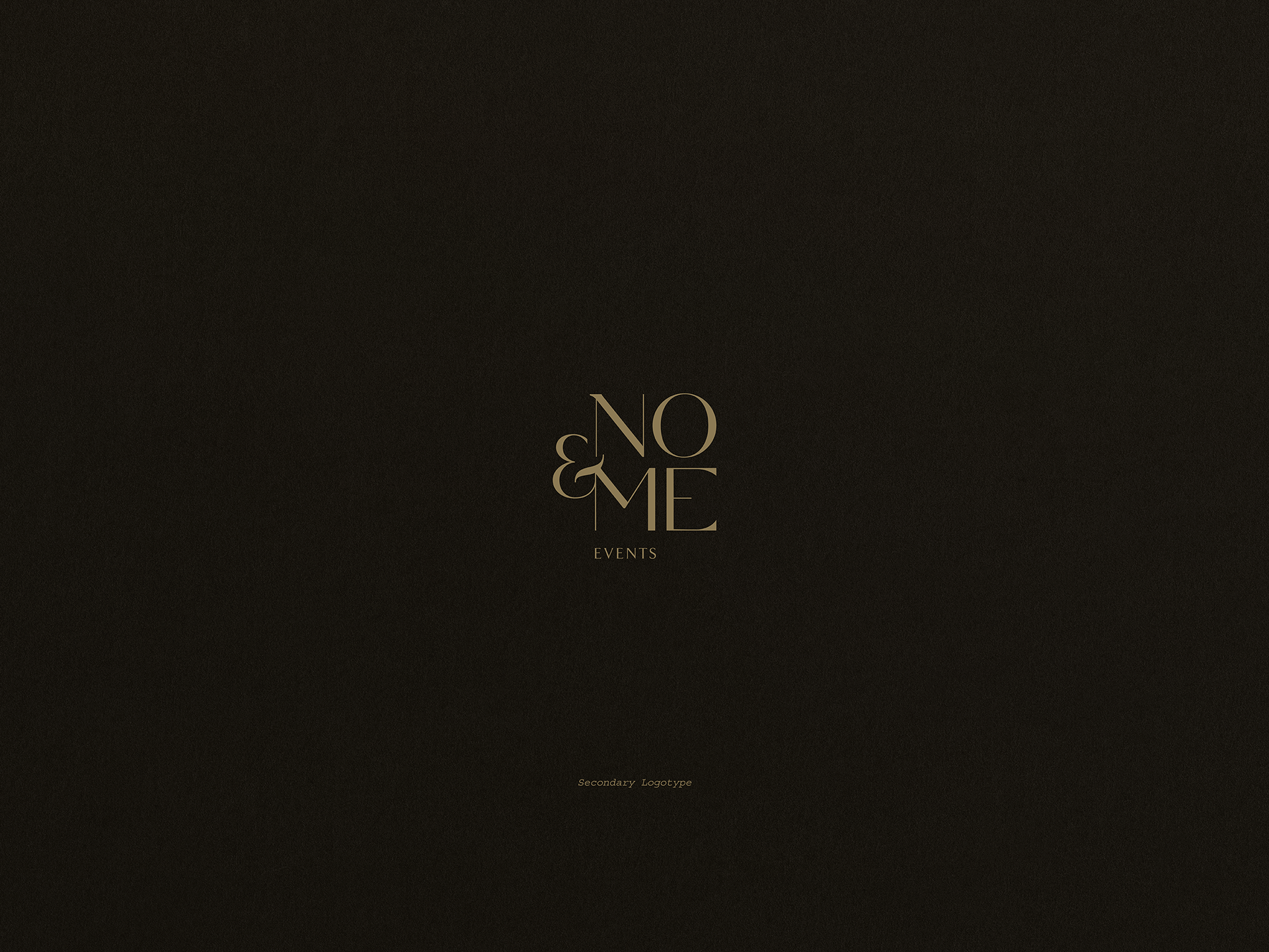
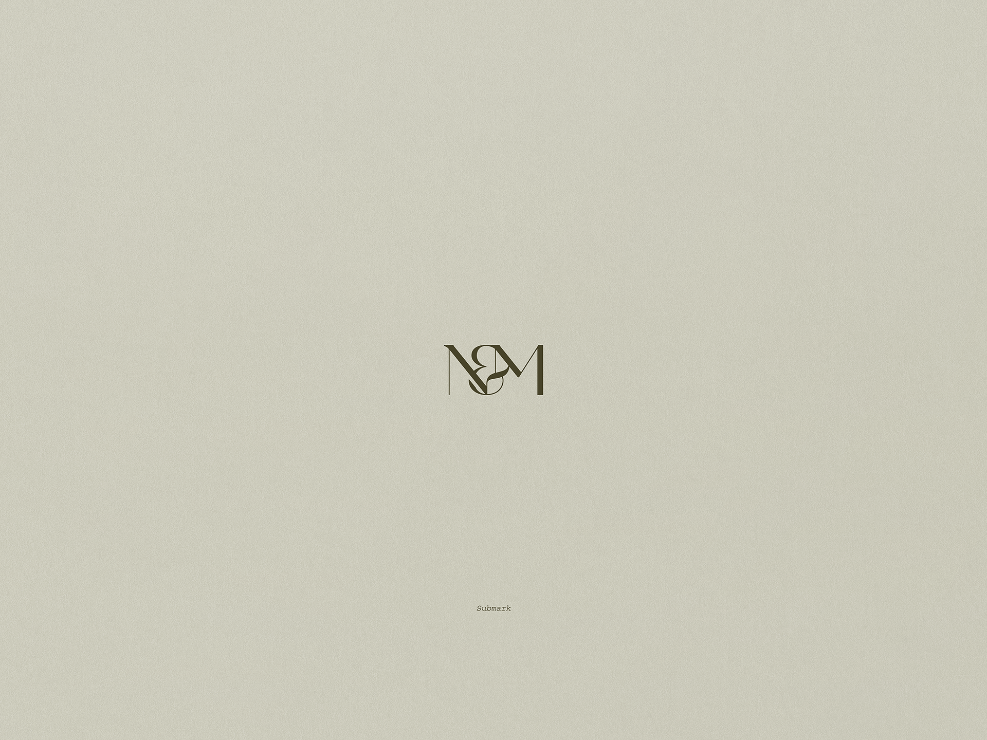
For the primary logotype, I used a serif typeface with two widths that give the whole a firm and timeless character. In the submark, I used the letter "&" as a link between the letters "N" and "M" to give it a fluid, organic character. On the other hand, in the secondary logotype, the letter "&" becomes a decorative element that acts as a link between the two levels that make up the logotype.
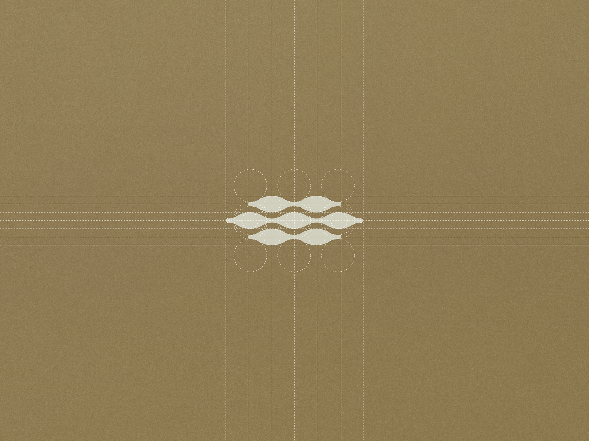
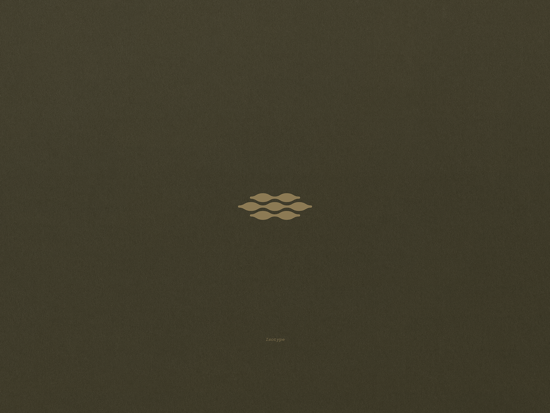
The construction of the isotype is inspired by two team-building sports activities, such as Canoeing and Tug Of War, from an aerial view, resulting in a graphic element with a rhythmic pattern. The 7 most voluminous shapes represent the 7 personal values that characterize Noémie Membrez: hardworking, believer, passionate, positive, determined, brave, and empathic.
I took inspiration from the colors Noémie most identifies with for the color palette, but adjusted them to create a connection with nature. The range of earthy tones is reinforced by the main color, Lisbon Brown. This allows No&Me to visually convey warmth, naturalness, security, and confidence.

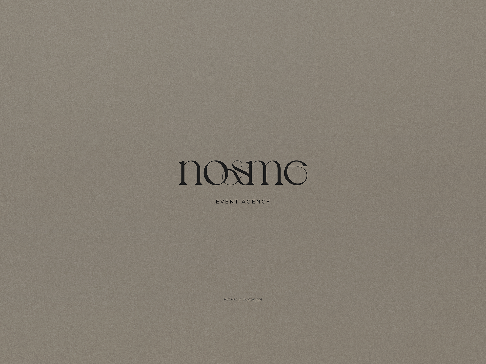
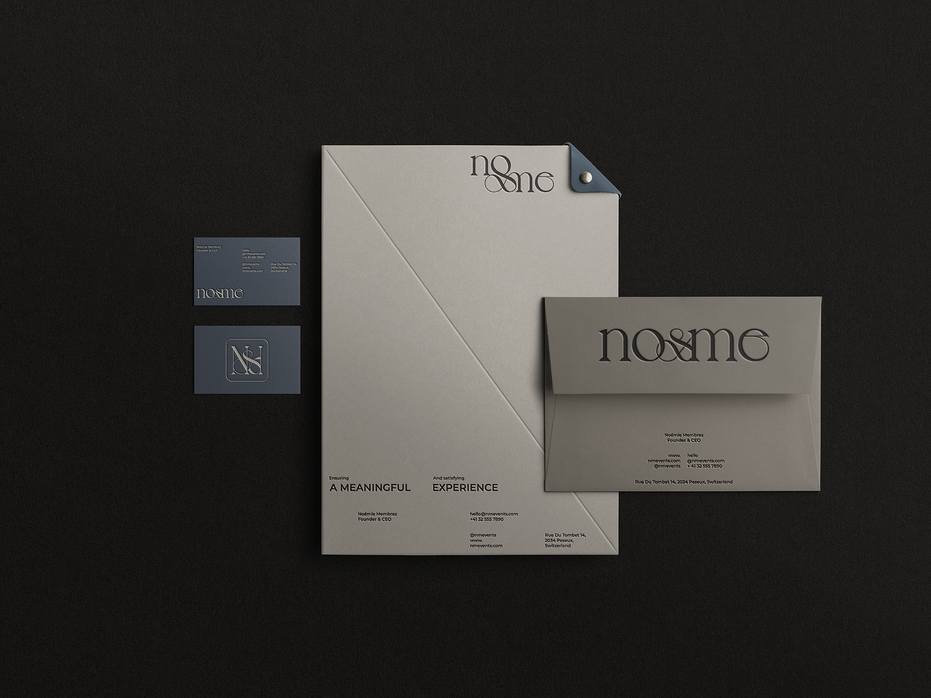
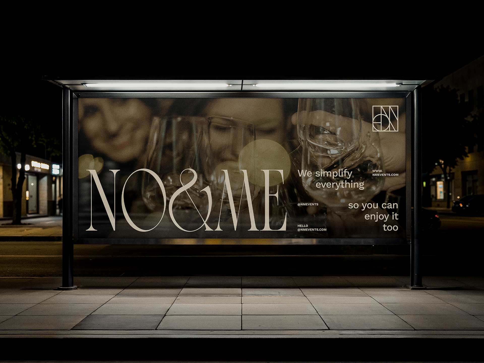
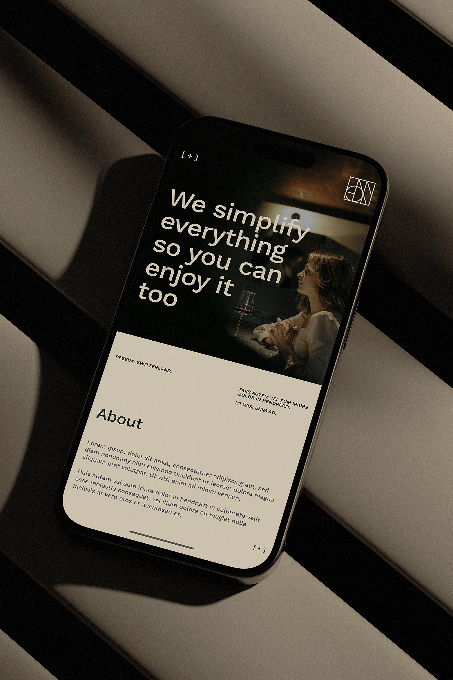
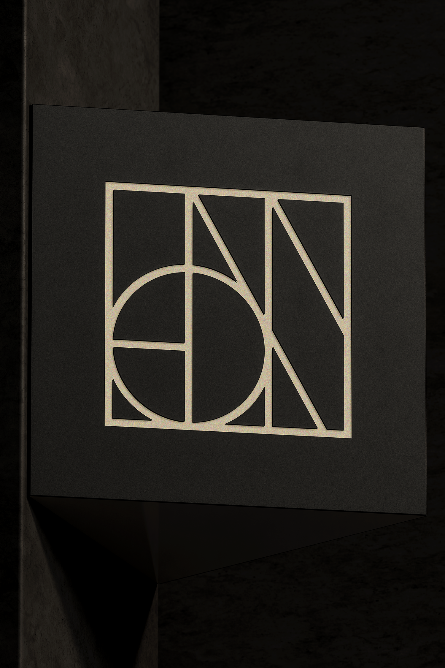
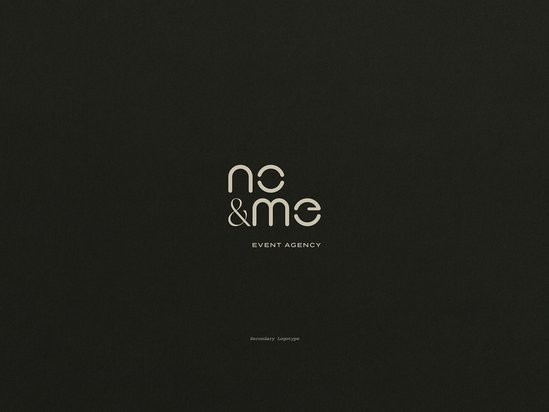
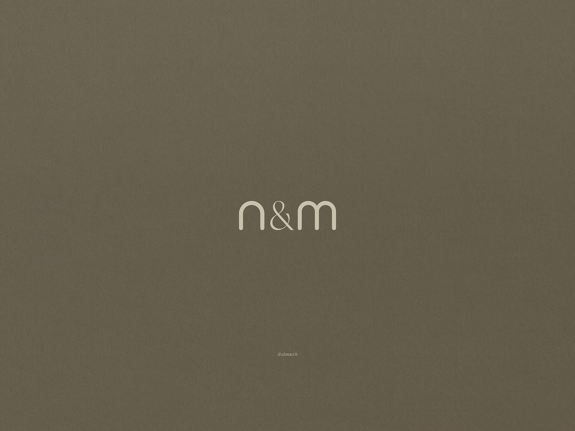
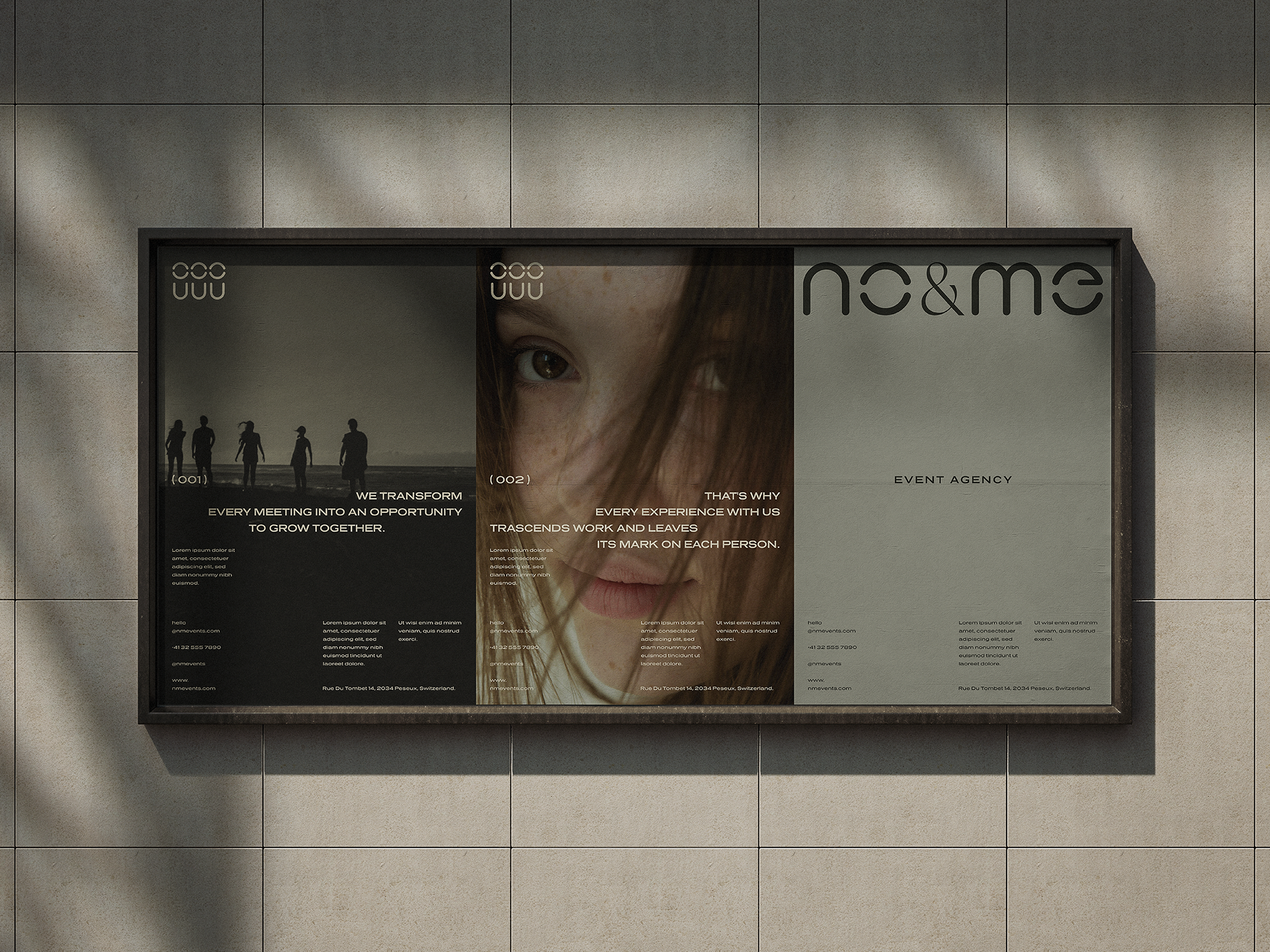
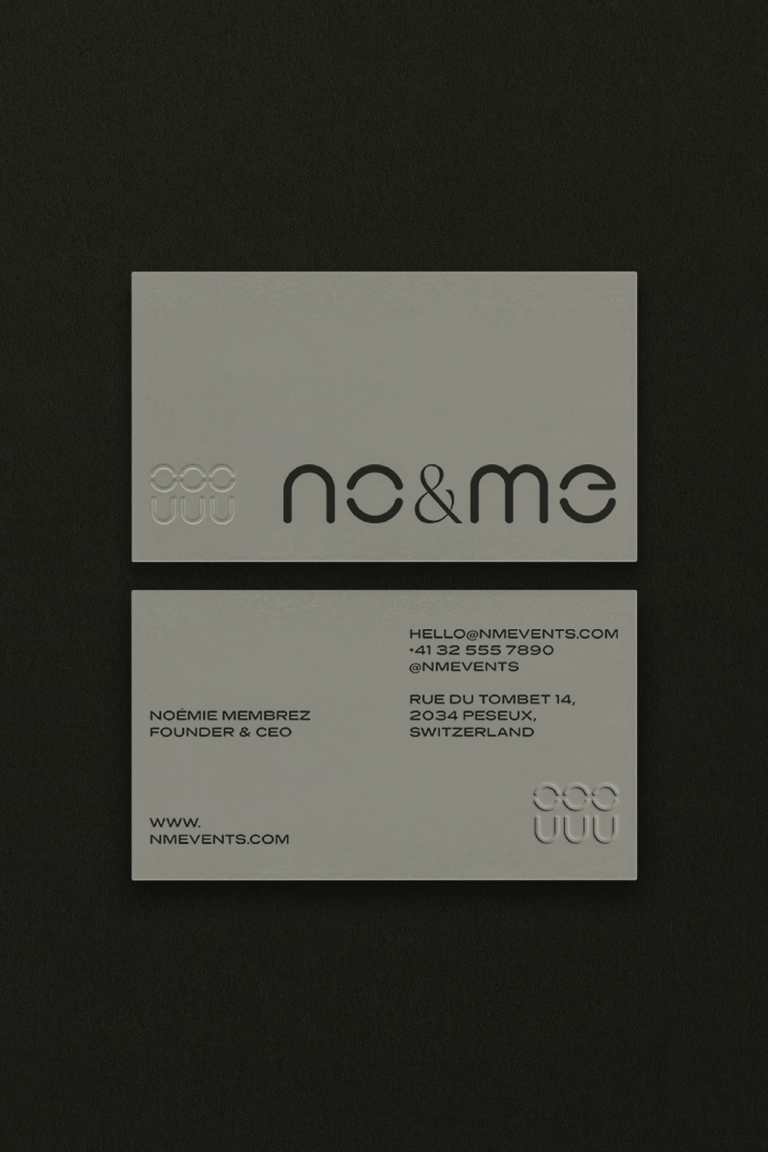
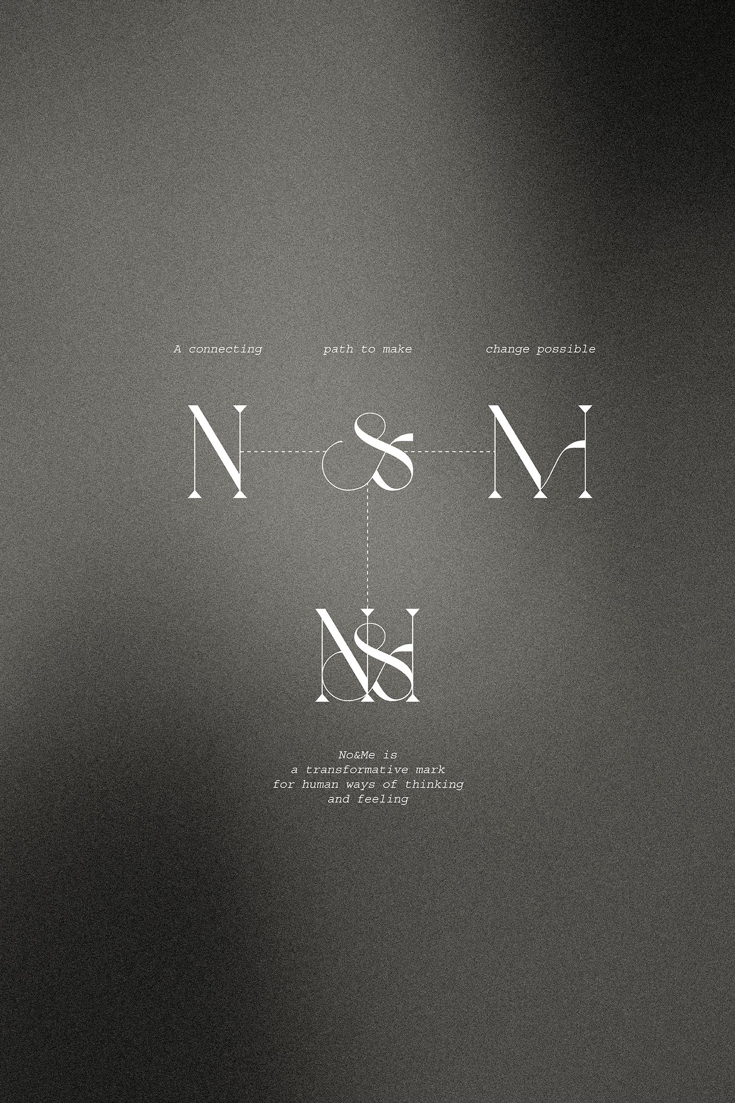
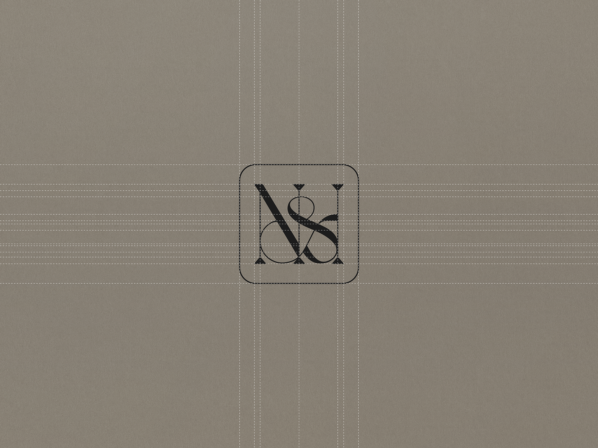
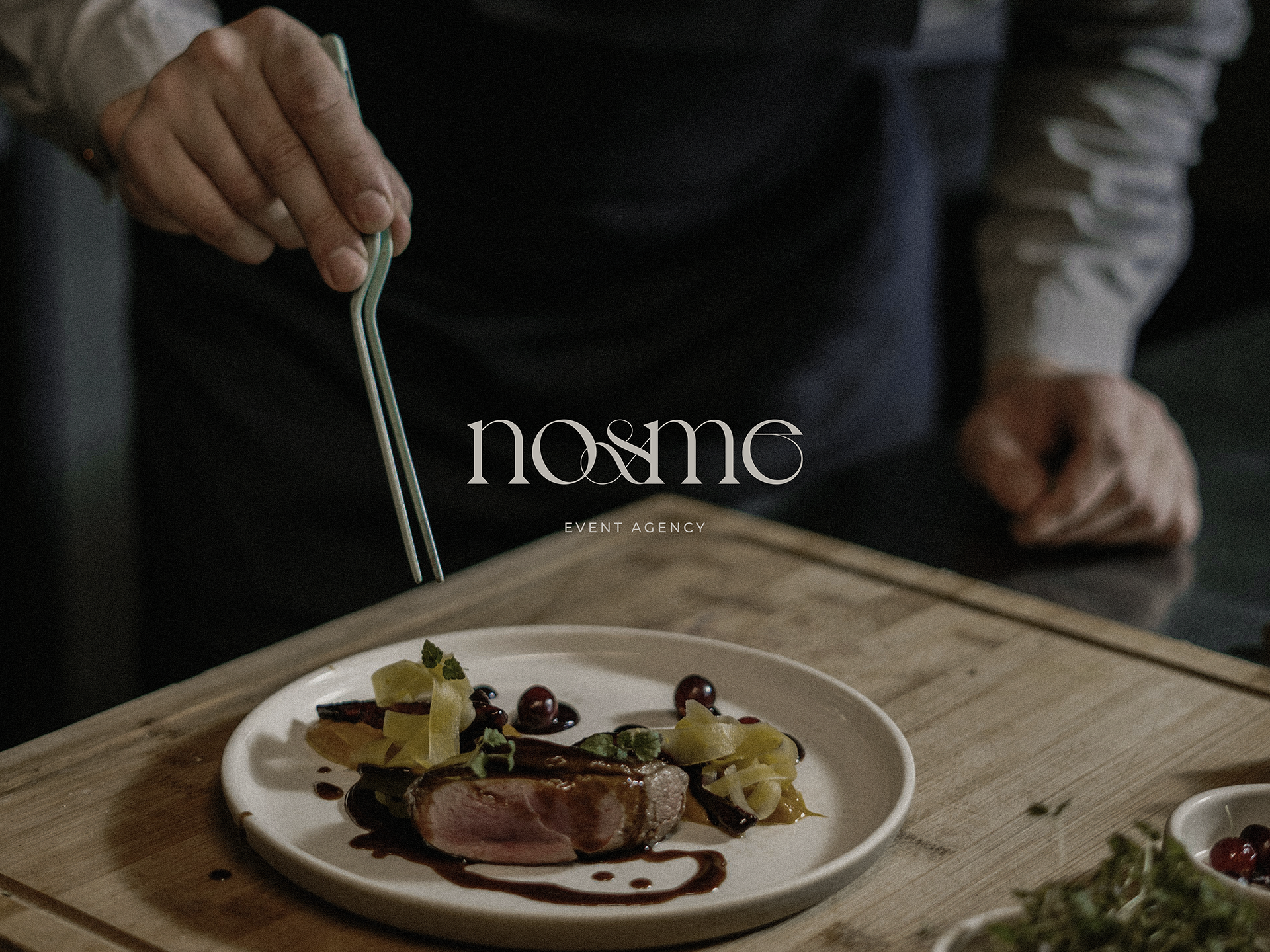
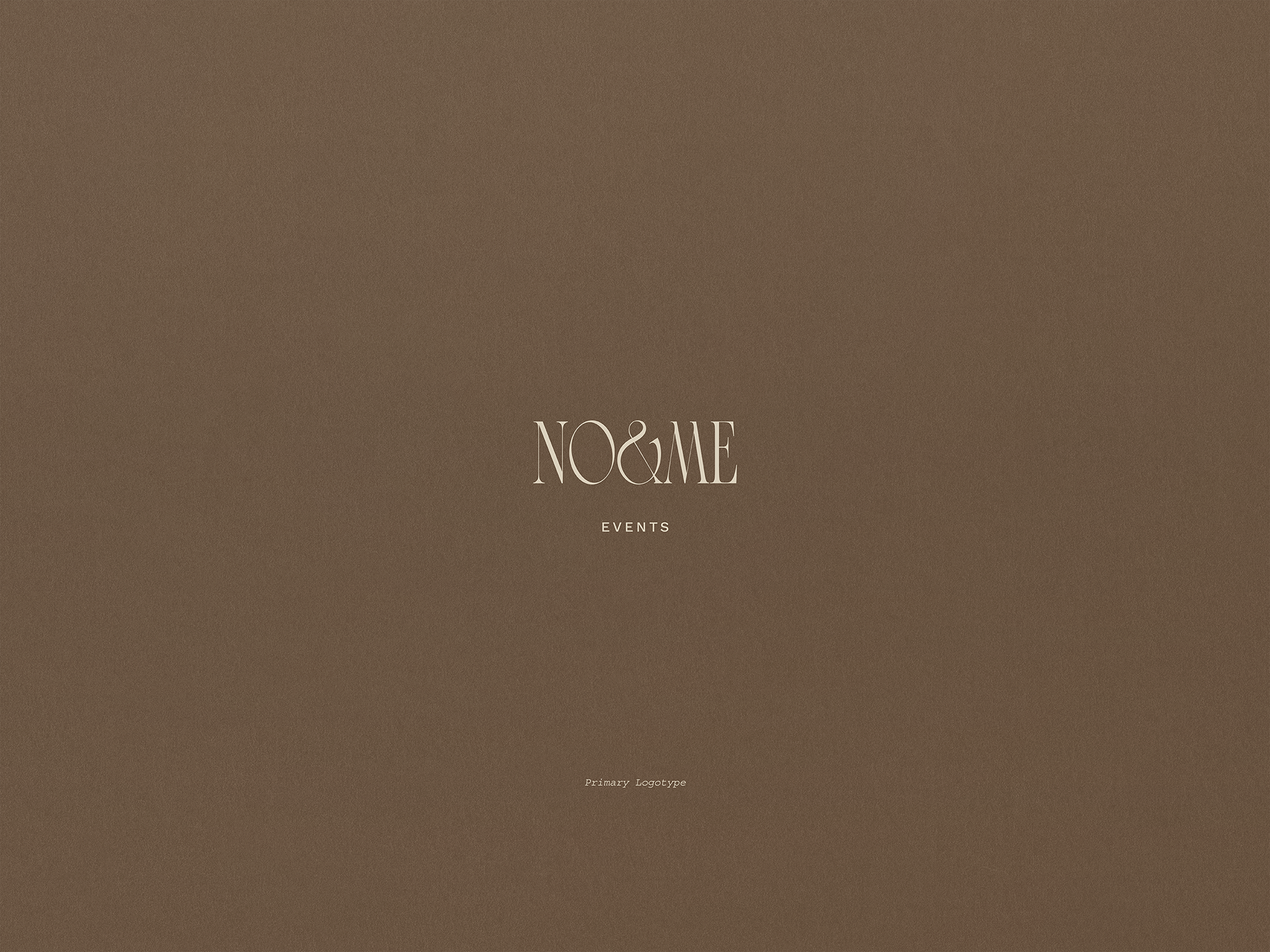
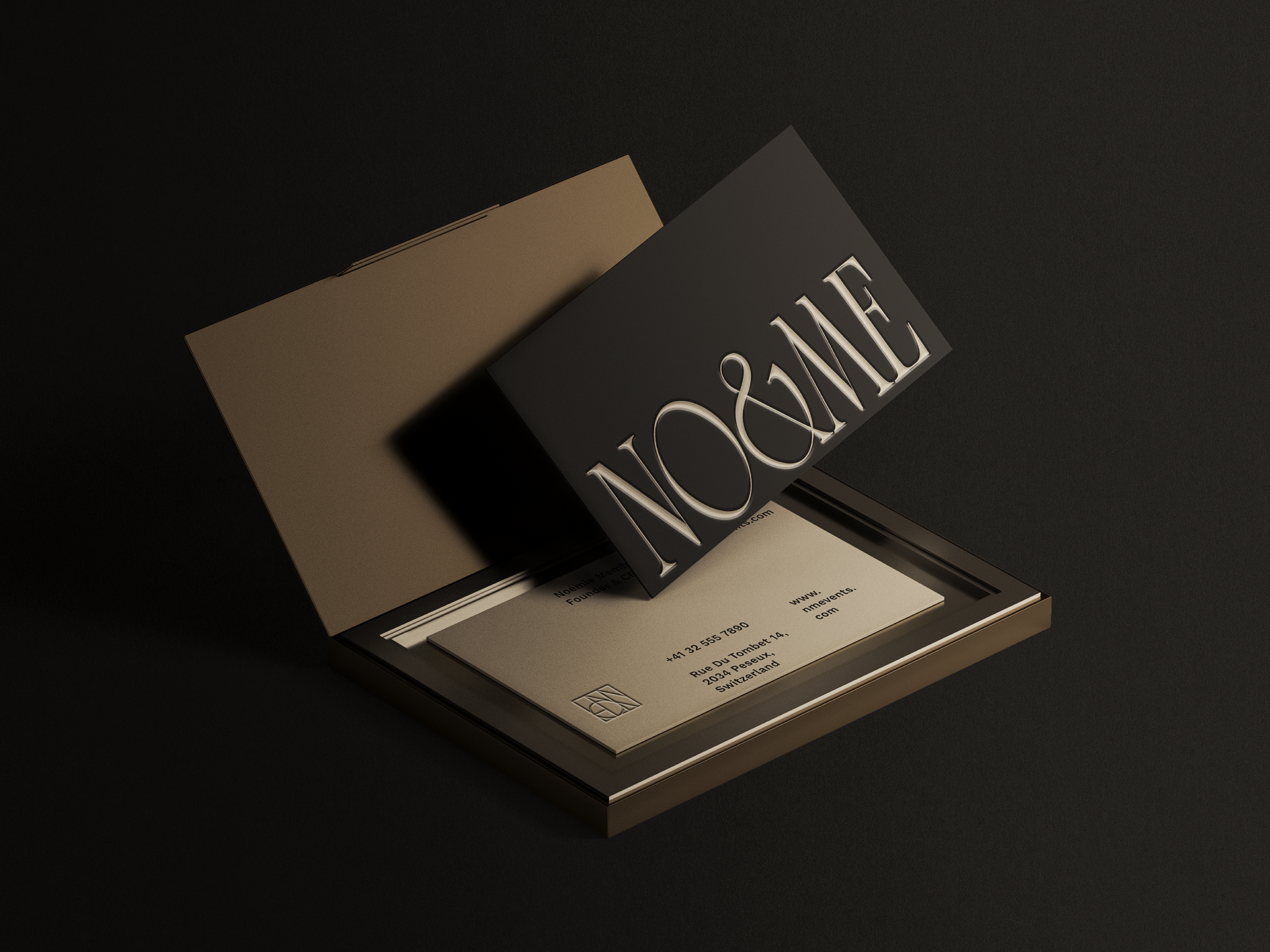
The third proposal is based on three keywords that define the essence of the No&Me brand: connection, transformation, and possibility.
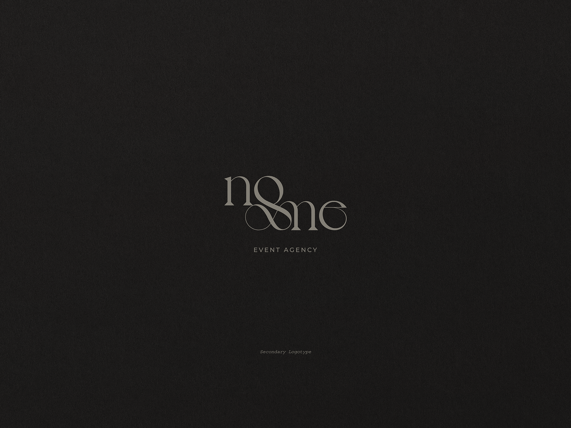
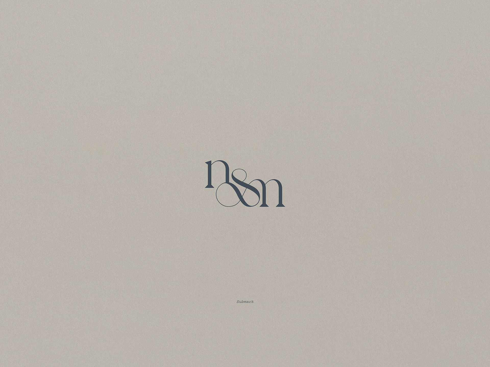
For the primary logotype, secondary logotype, and submark, I worked with a serif typeface in two widths that gives the whole an elegant and timeless essence. The letter "&" acts as the main element and link between the syllables "no" and "me" and the letters "n" and "m". This graphic element translates into an organic shape that represents a connecting path to make change possible. This translates into the function that No&Me fulfills as a transformative mark for human ways of thinking and feeling.
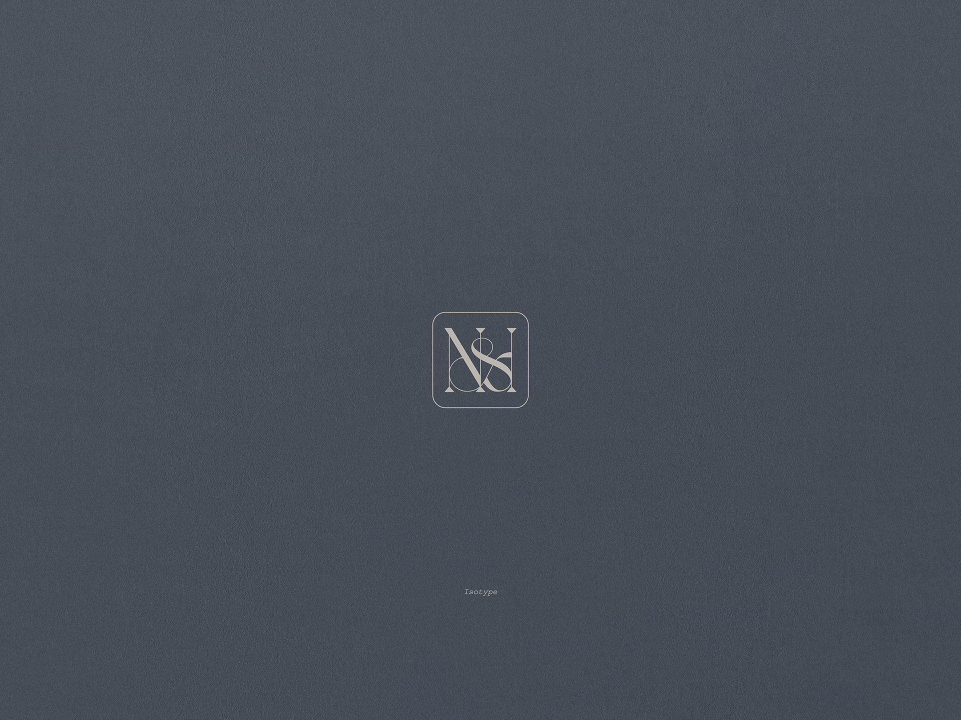
The fluidity of this graphic element also takes center stage in the isotype. In this element, the capital letters "N" and "M" are joined to form a triad of columns connected by the letter "&", which also represents the three keywords of this proposal.
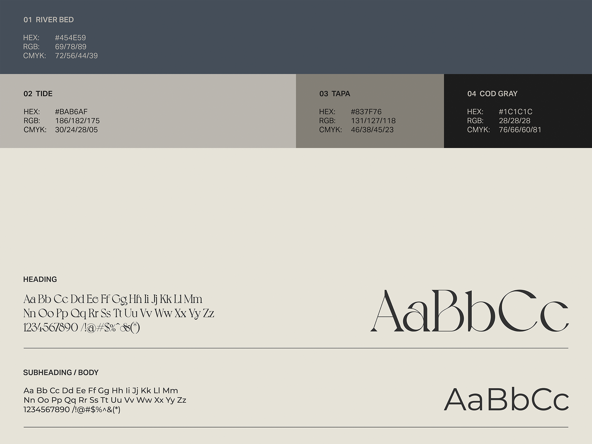
For its part, the color palette creates a balance between soft neutral tones and the River Bed color as the protagonist to denote innovation, authenticity, respect, and professionalism.

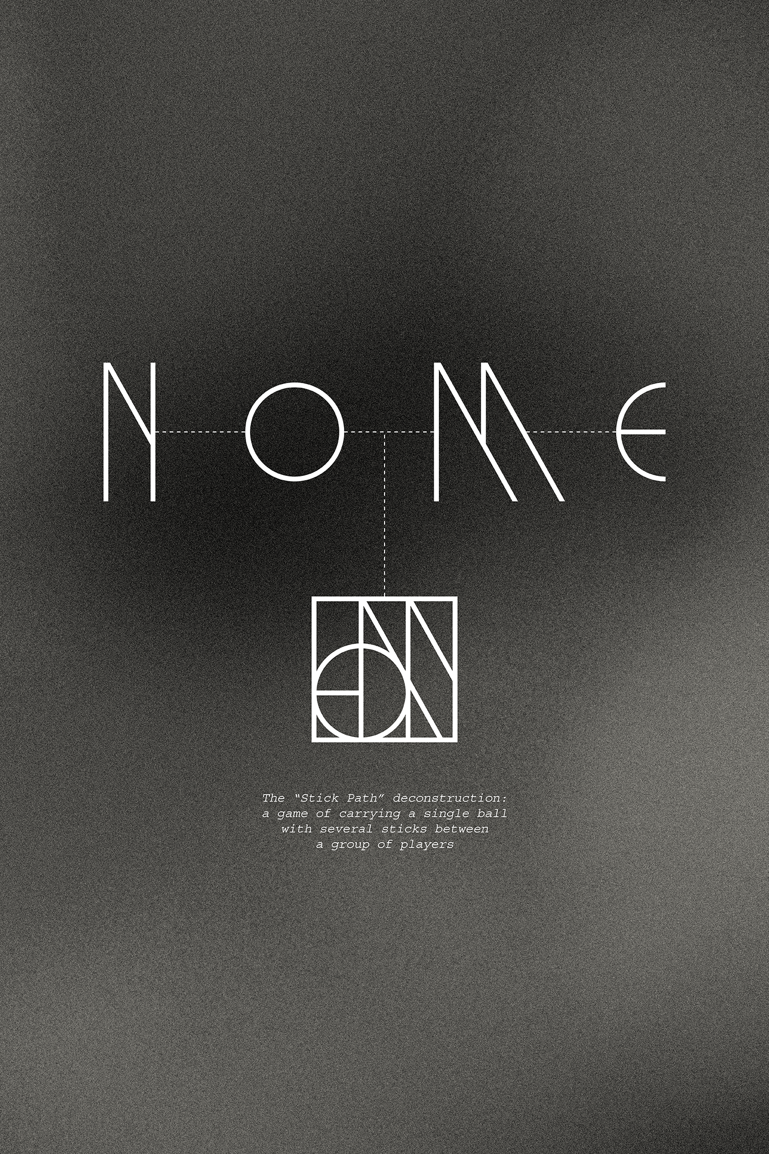
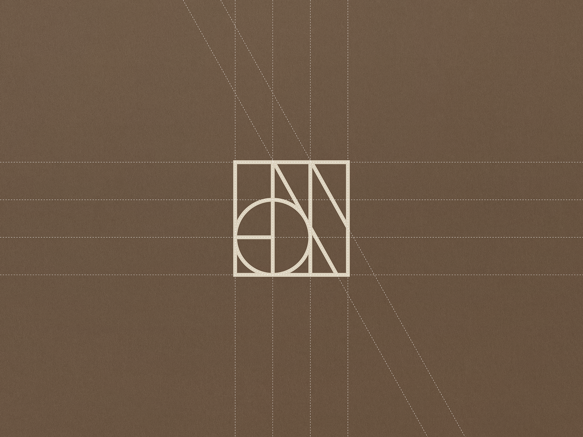
The fourth and final proposal is based on two concepts that differentiate No&Me from its competitors: innovation and excellence.
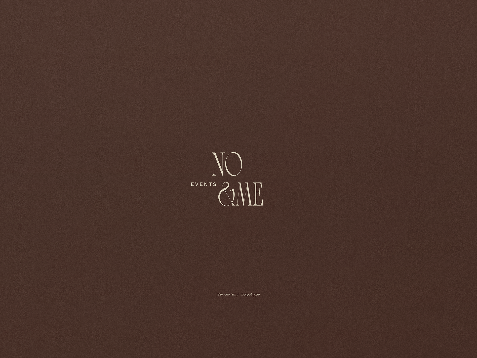
The primary logotype is an innovative modern serif typeface with two widths and pronounced borders. The close proximity of the letters gives the overall graphic ensemble a distinctive character. The secondary logotype uses a syllabic division organized in two levels to express a more informal version of the main logotype. The organic nature of this typographic set also enabled me to develop a sub-brand reminiscent of elite sports groups' monograms.
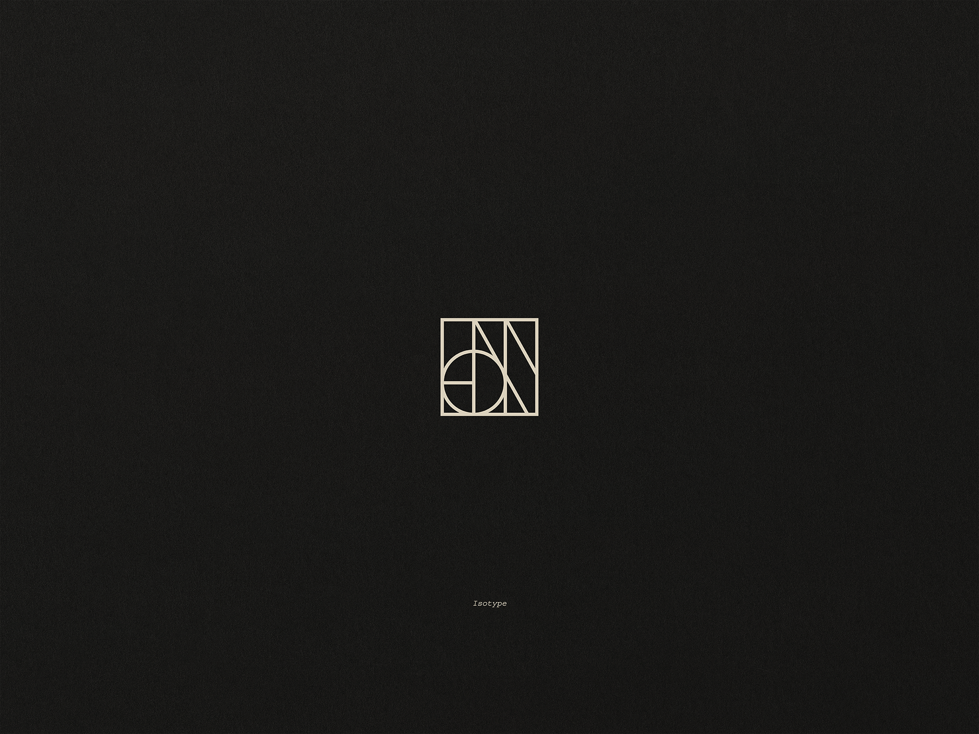
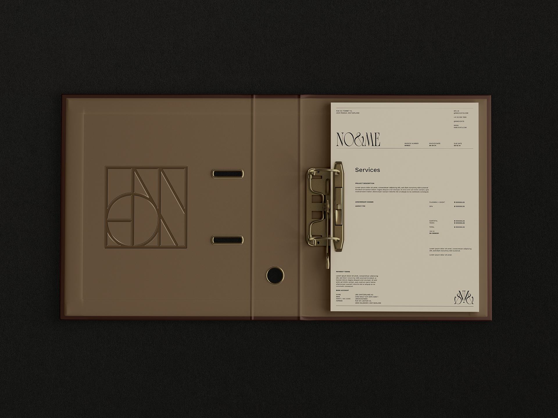
The construction of the isotype communicates excellence through a grouping of straight lines of equal width, resulting in a typographic deconstruction inspired by the Stick Path, a game of carrying a single ball with several sticks between a group of players, one of the most famous outdoor team building activities. Separating each element that is part of this set, the letters “N”, “O”, ‘M’ and “E” are obtained.
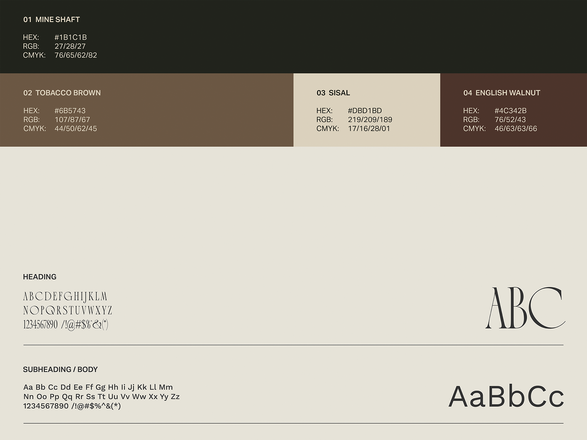
Finally, the color palette balances the sobriety of the main tone, Mine Shaft, with Tobacco Brown, which adds warmth and class. Overall, this color scheme conveys knowledge, good behavior, security, and reliability.